

User interfaces present information to the and gather input from the user. An Apex Designer user interface (pages and components) manage this information as properties. The properties section is on the top left of the User Interface page:
Adding a Properties
You can add a property by entering the name:
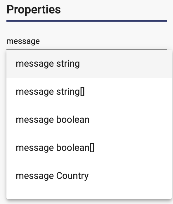
The picture above shows the default of string. You can click the type or press enter to create the property. If you want something besides a string, you can enter a space followed by part of the type name:
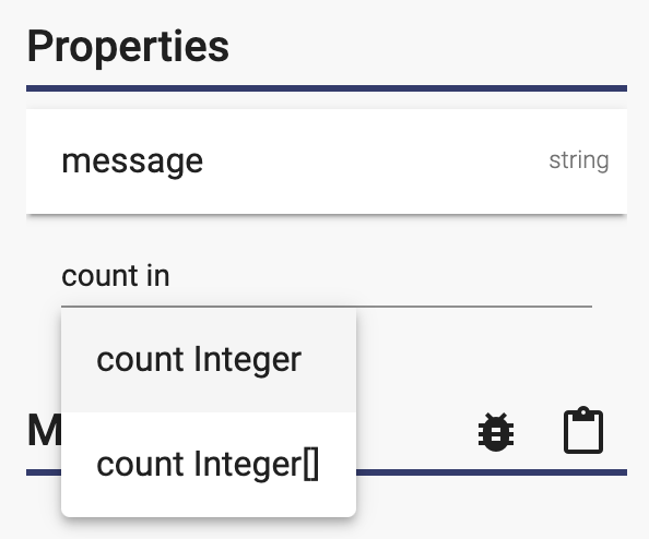
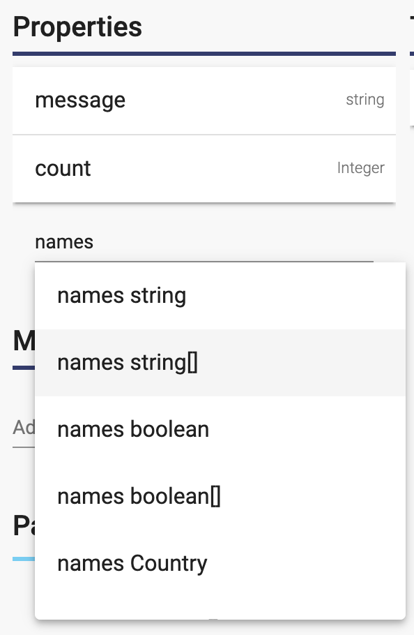
If you want an array of values, you can select the desired type with "[]" after it:
Setting Defaults
You can click on the property to open the Property Dialog and enter the default:
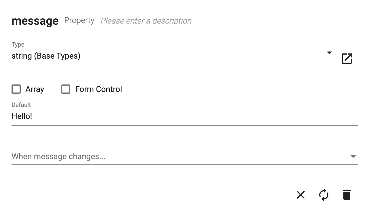
You can also check/uncheck the "Array" checkbox to change it to/from a list.
Displaying a Property
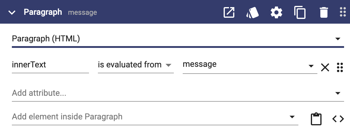
You can display a property by binding it to the attribute of a user interface element with "is evaluated from":
You can also combine text and properties in the attribute value using double curly braces with "is" binding:
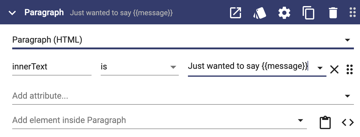
The example above will display "Just wanted to say Hello!" because the default on message is "Hello!".
Managing Properties
You can reorder properties using drag and drop. To delete a property, click on it to open the property dialog and click the Delete icon button.
Component Inputs and Outputs
If you are working on a user interface that is a component, a property can be an input, an output, both or neither. To make a property an input, open the property dialog and check the input checkbox:
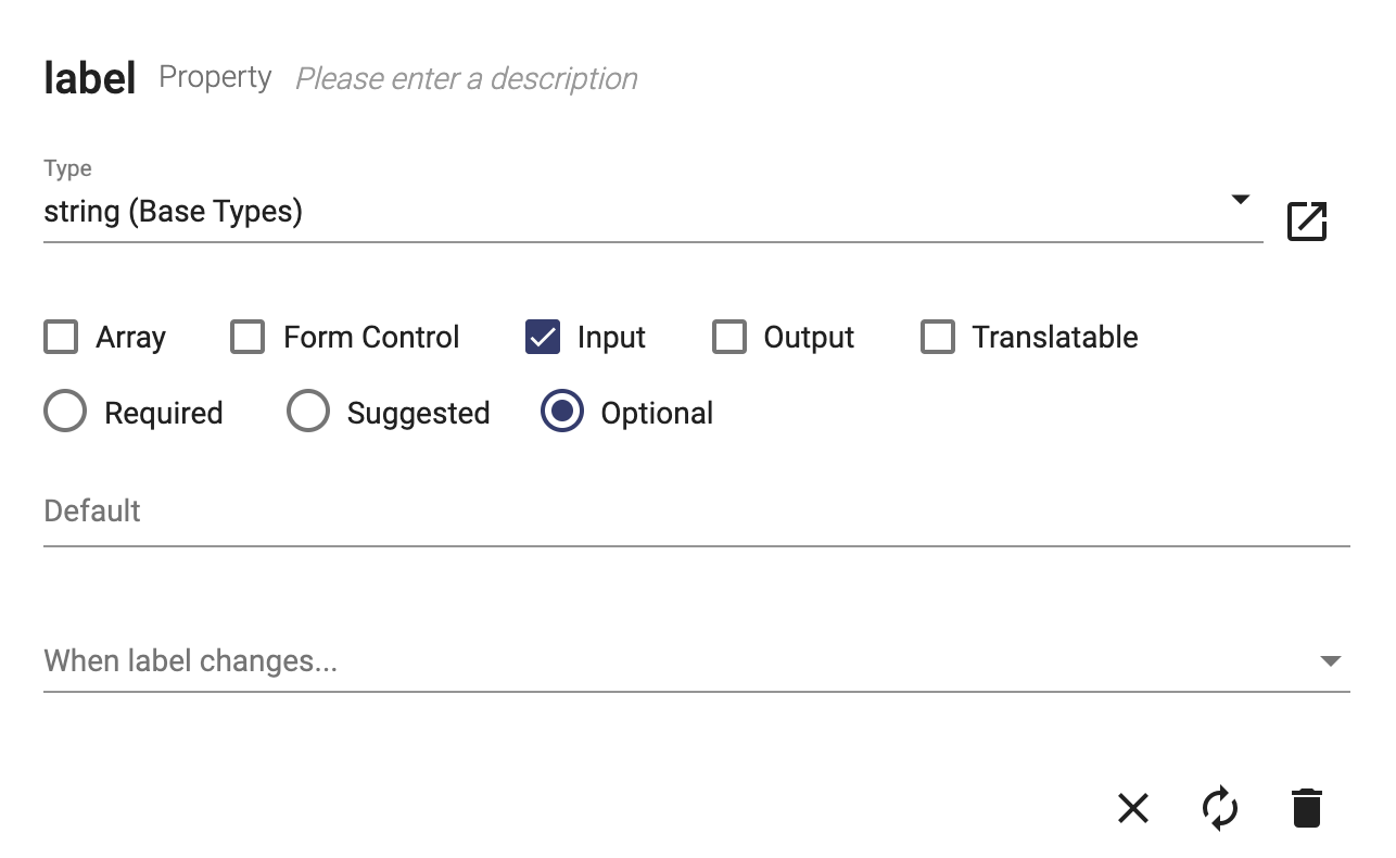
The radio buttons are shown for inputs:
- Required - when the component is used, the attribute will automatically be added and cannot be removed
- Suggested - when the component is used, the attribute will automatically be added but the user can remove it
- Optional - when the component is used, the attribute is not added but the user can add it using the typeahead
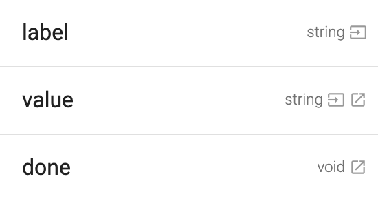
Icons on the property indicate whether it is an input, and input/output, or just an output:
Page Path Properties
If you are working on a user interface that is a page, you can set property values from portions of the url. Consider this example:
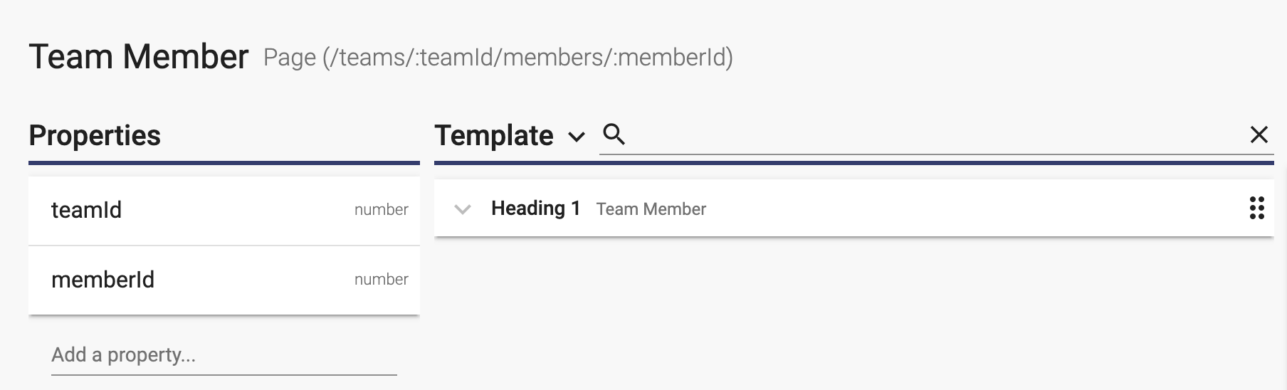
Notice that the path for the page includes ":teamId" and ":memberId". If the user opens the url "/teams/47/member/74", teamId will be set to 47 and memberId will be set to 74.
Dig Deeper
You now have a basic understanding of user interface properties. You can dig deeper with the following topics:
This page does not have any child pages.