

The template of a user interface defines what the user sees, and is composed of a hierarchy of user interface elements. They can be simple HTML elements like "Heading 1" or "Paragraph" or complex components like the "Table" from the Dynamic Components library.
Managing Elements
A user interface starts out with an empty template:
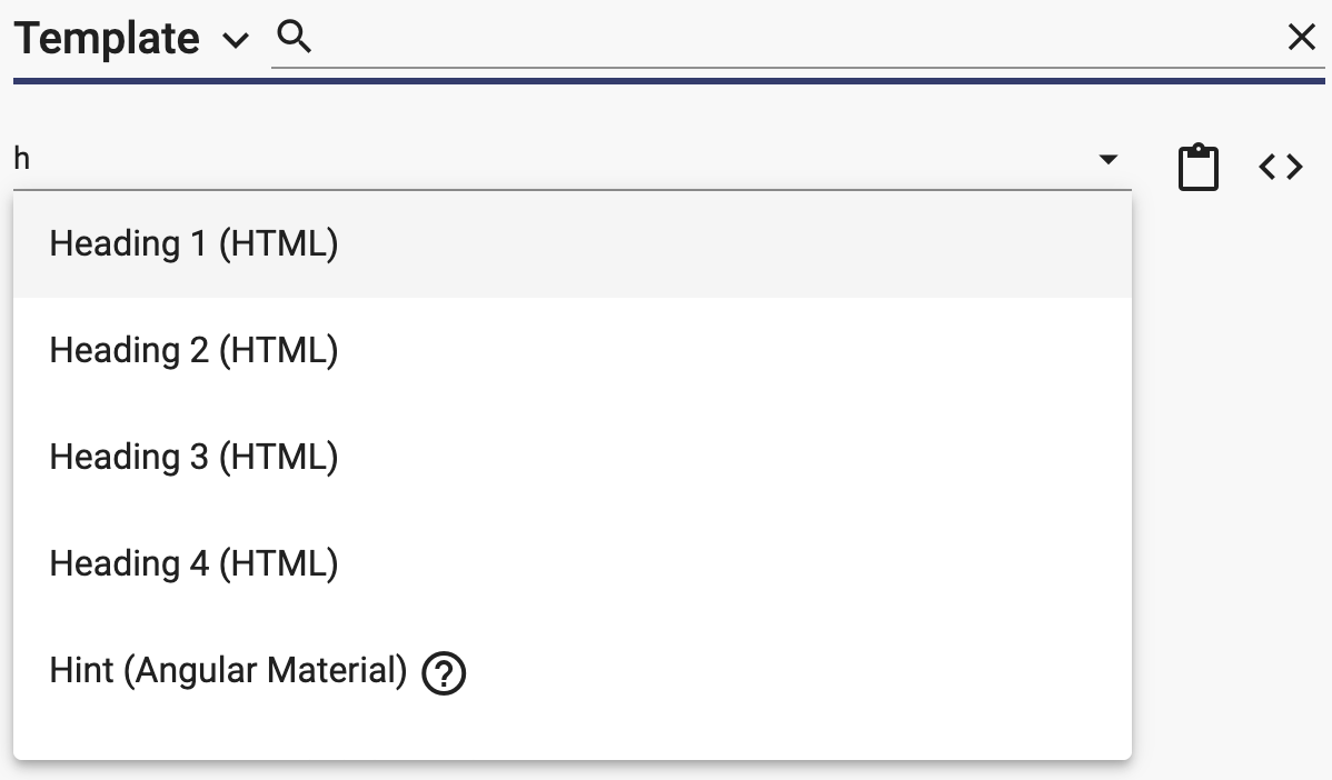
You can add elements to the template by dragging them from the palette onto the template. You may find that typeahead is a faster way to add elements:
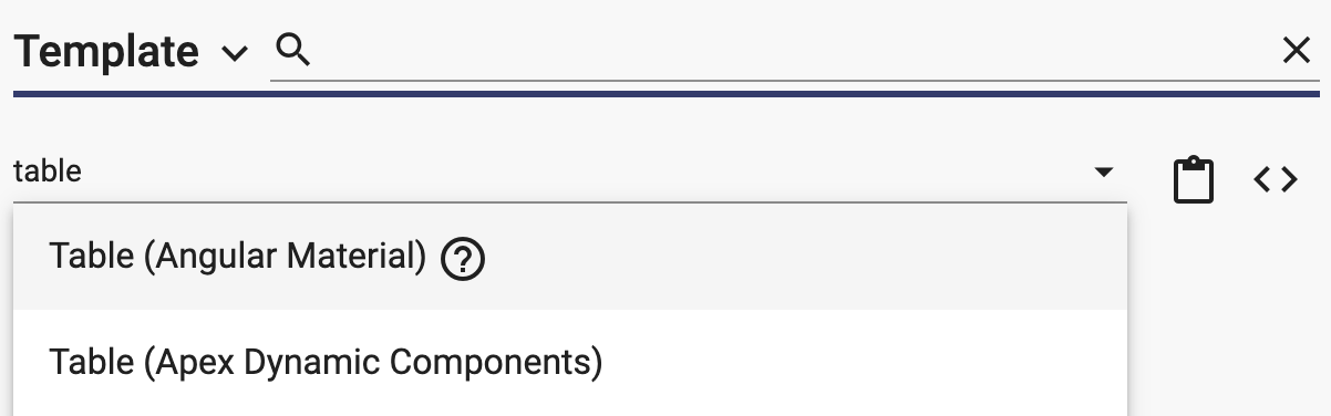
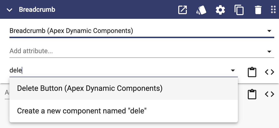
The typeahead shows the component name with the library name in parenthesis. This is helpful when similar components are available from different libraries:
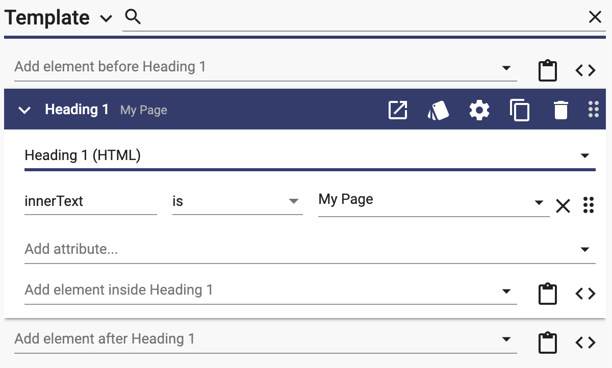
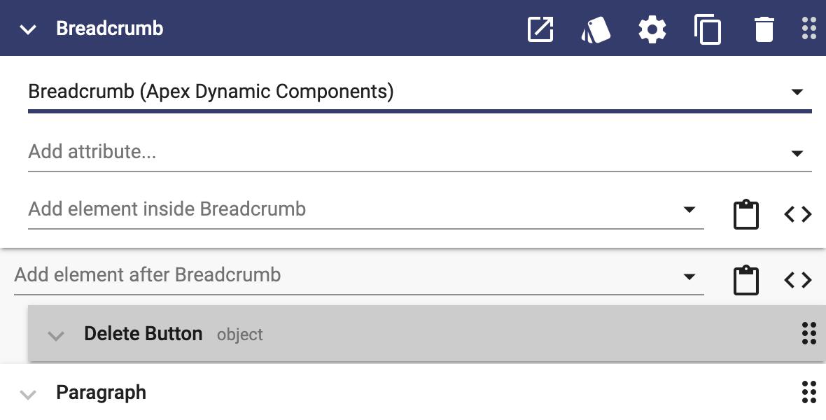
You can add elements before or after an element:
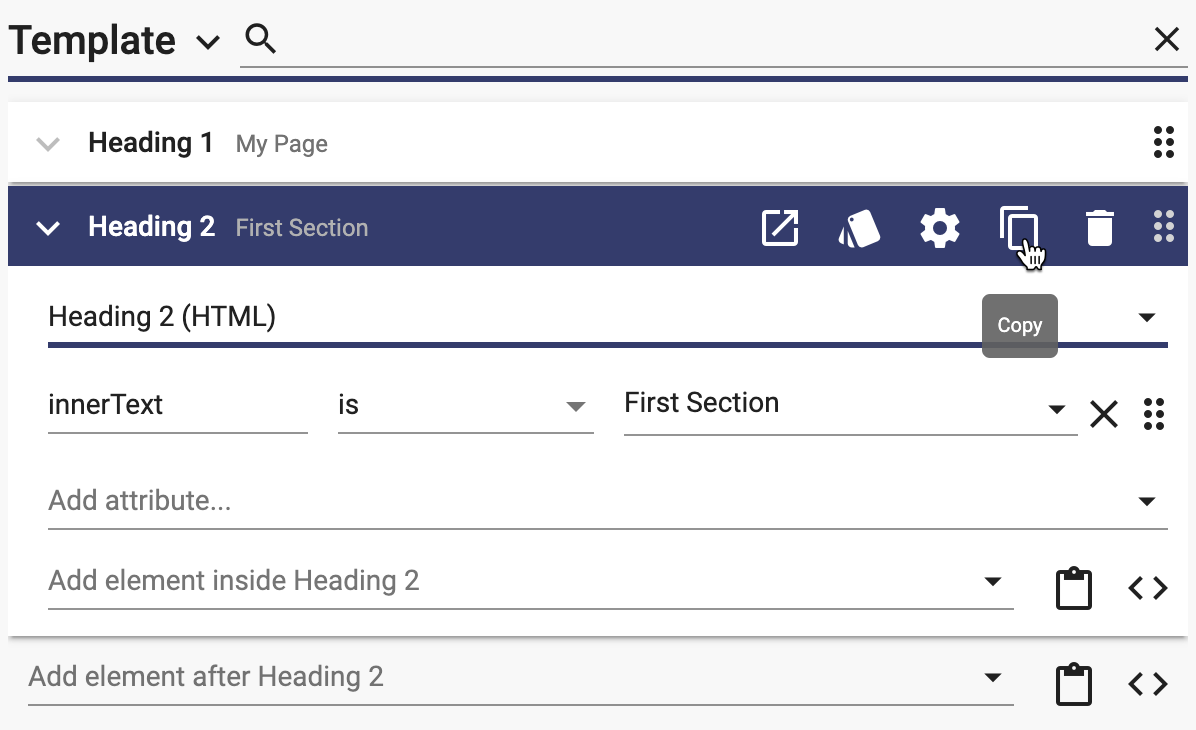
You can copy an element:
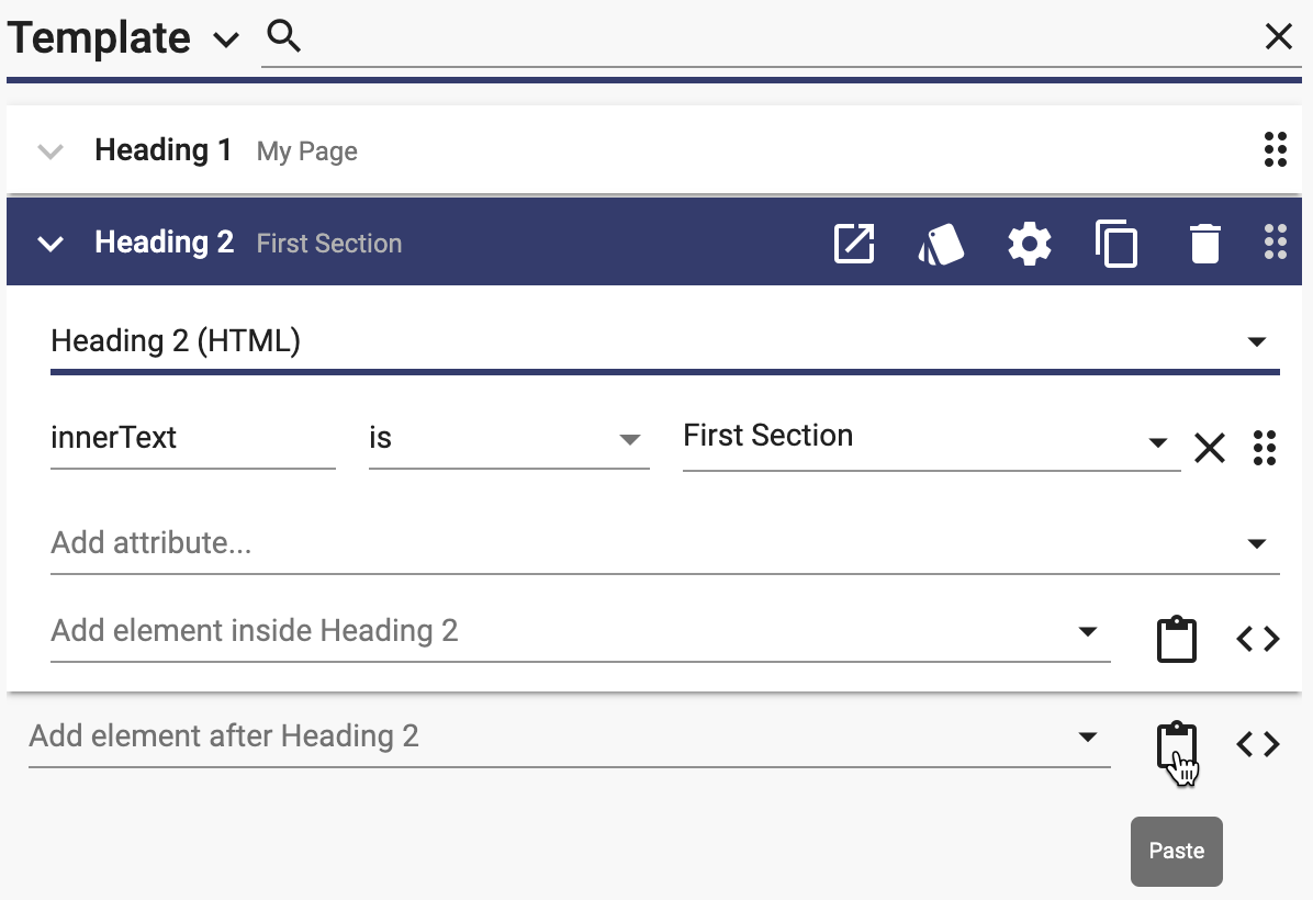
And then paste it after another element:
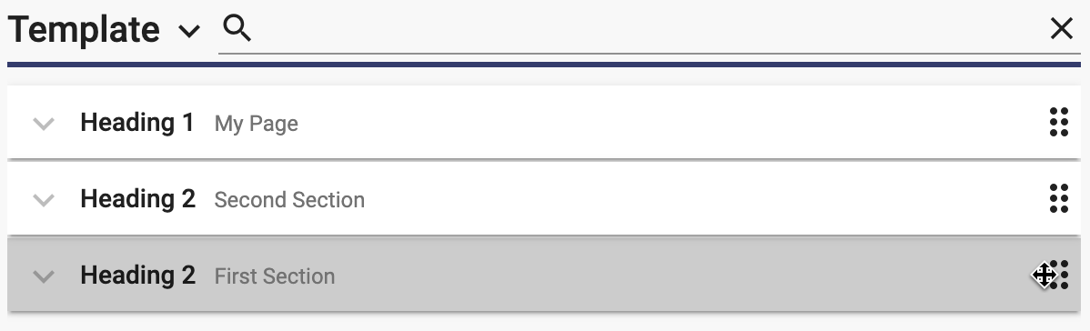
You can reorder elements by using the drag handle on the right (be sure that the element you want to drag is collapsed):
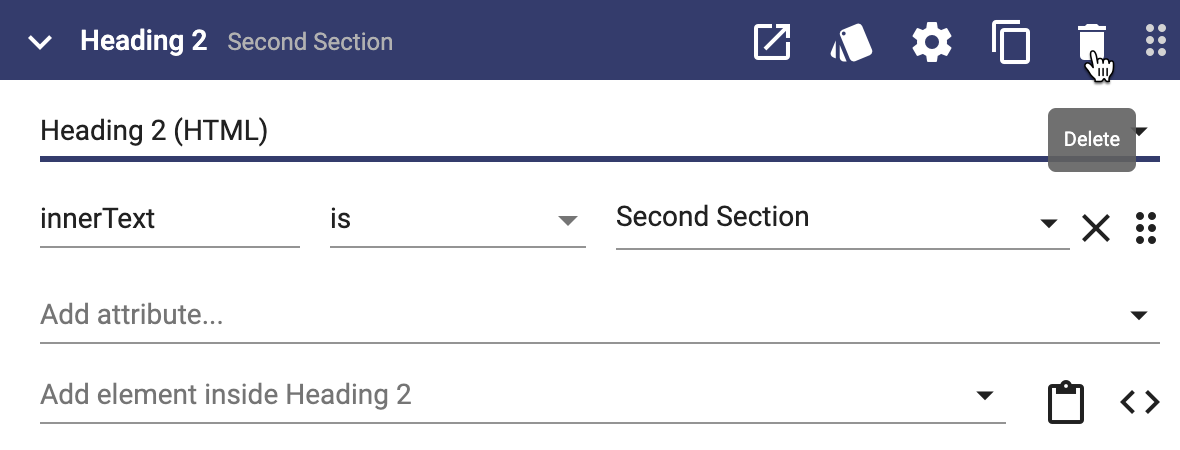
You can delete an element by clicking the delete icon button:
Element Hierarchy
Elements can be nested to form a hierarchy. You can add an element inside another element:
You can also drag an element inside another by dragging it from left to right:
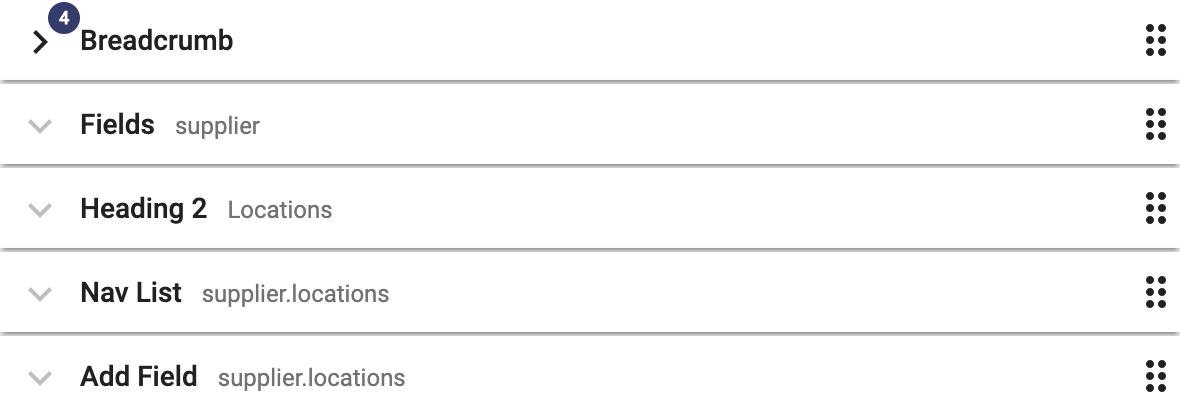
You can collapse an element that has other elements inside it by clicking the down arrow to the left of its name. A collapsed element will show a badge with the number of elements that are not shown:
Attributes
Each element can have attributes. You can think of the attributes as inputs to the underlying component and actions triggered by the component.
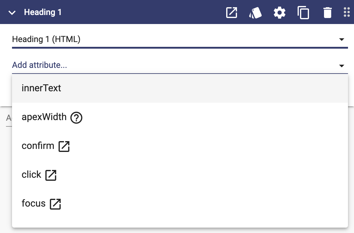
You can add attributes using the "Add attribute..." typeahead:
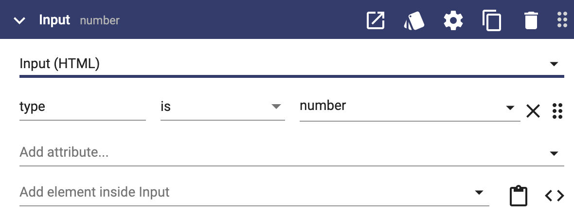
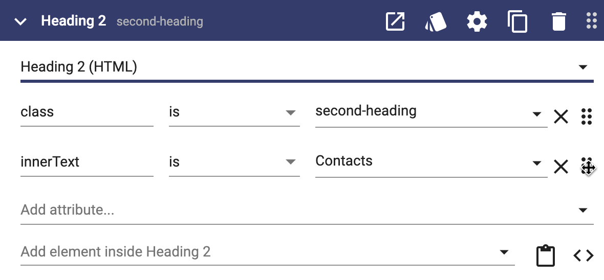
Attributes can be static values:
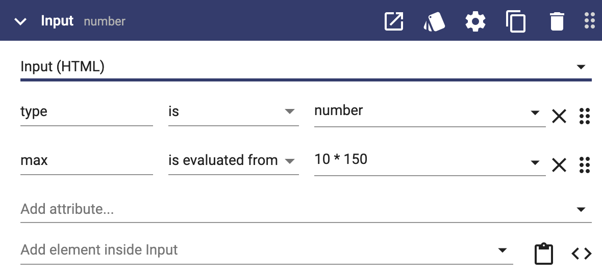
Attributes can be evaluated from expressions:
Some attributes have no value (there are just there):
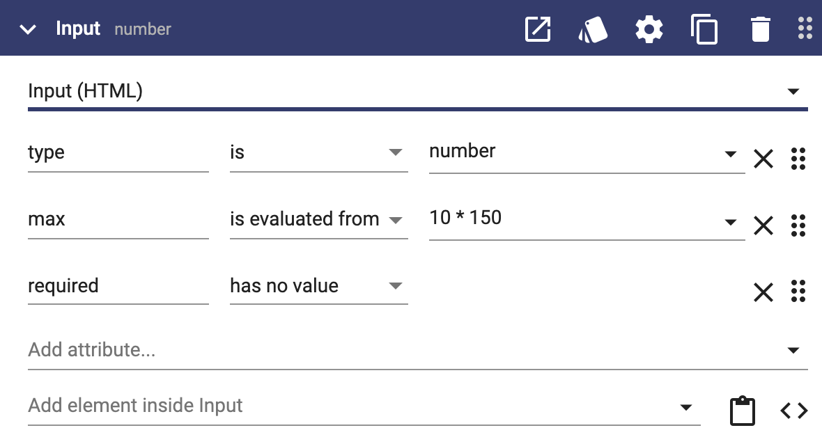
"is", "is evaluated from" and "has no value" are binding types. There are two additional binding types ("is linked to" and "triggers") that will be covered in User Interface Properties and User Interface Methods respectively.
The first attribute of an element is shown in the heading bar to help differentiate multiple instances of the same component:
You can drag the attribute that is the best identifier to the top of the list using the drag handle:
You can read learn more about user interface elements on these pages:
This page does not have any child pages.