Controlling how your components appear when you use them in design mode, can lead to a more pleasurable design experience. With Apex designer you can configure the appearance of a user interface component by going to the "Outline Element Preview" section of the settings dialog for the user interface component.
The fist two checkboxes allow you to turn off the component label when it is added to another component or to have the children collapsed by default. If your component is large or complex, this could make the parent component initially cleaner.
You can also add a background color and an icon:
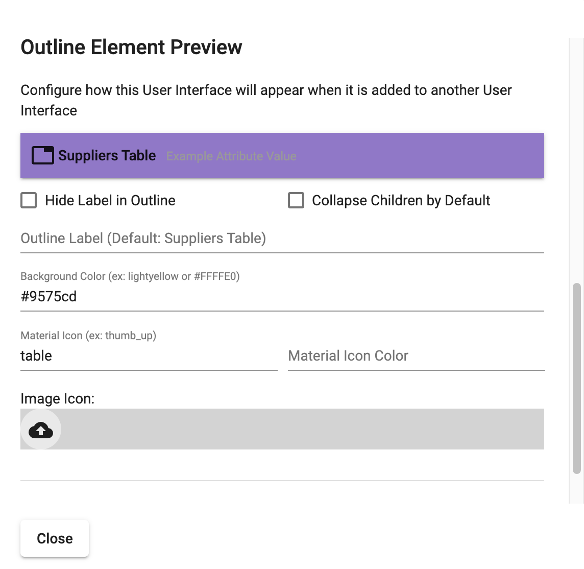
If you wanted to use a custom icon instead of a material icon, you can upload an image by pressing the upload Icon.
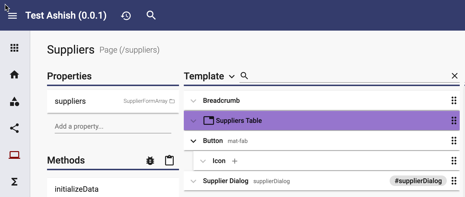
When you use this element in any other user interface, it will display with the configured color and icon: