

Need user interfaces in a hurry? The Dynamic Components library lets you get your app up and running instantly by just defining your business objects. Then, you can increment your way to the final design.
The library packages commonly used Angular Material patterns, some are automatic while others let you quickly customize user interfaces. These can be broken down into dynamic pages, metadata driven components, layered overrides and common patterns.
Dynamic Pages
Dynamic pages are automatically generated pages based completely on the business objects within the app. A dynamic page shows fields for each parameter defined in the business object and also handles presenting any related business objects.
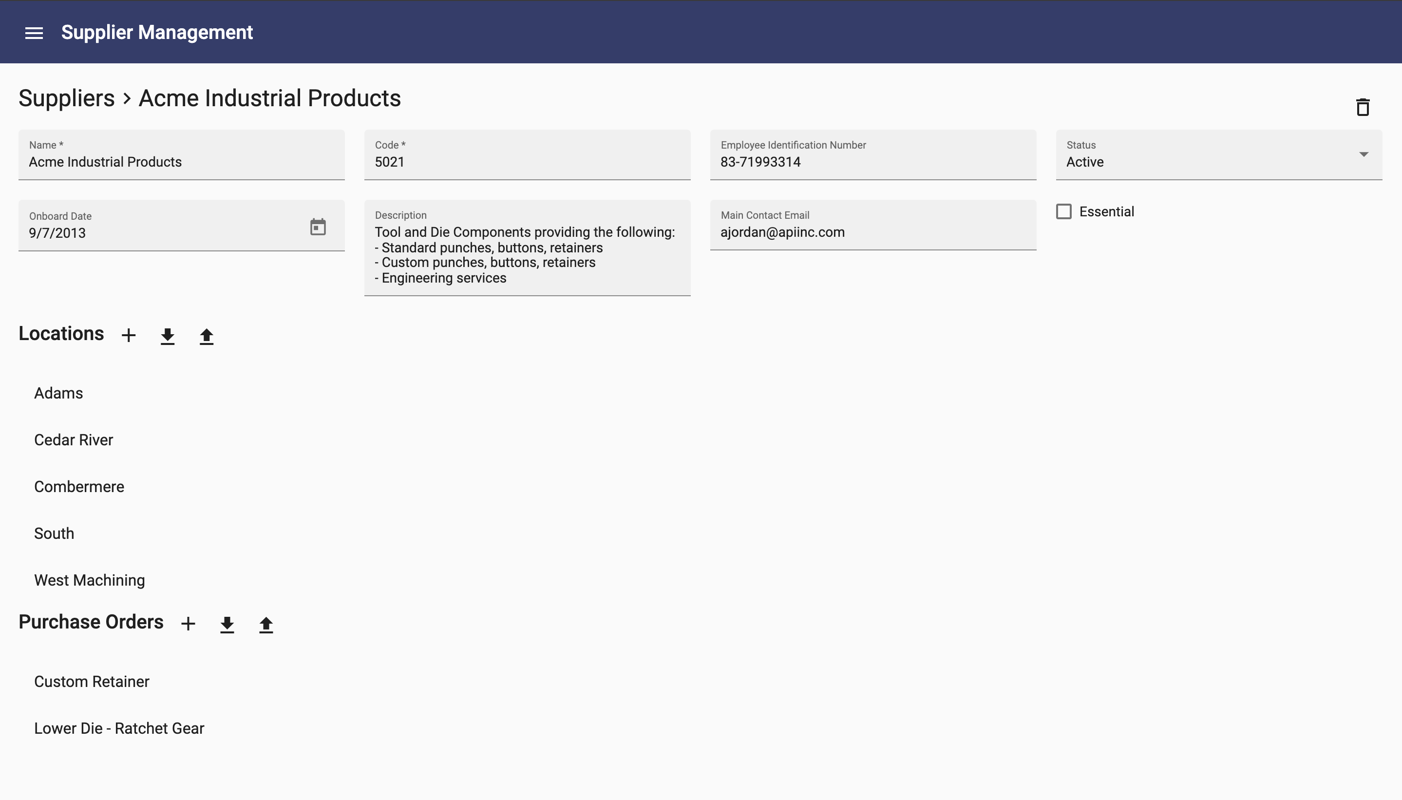
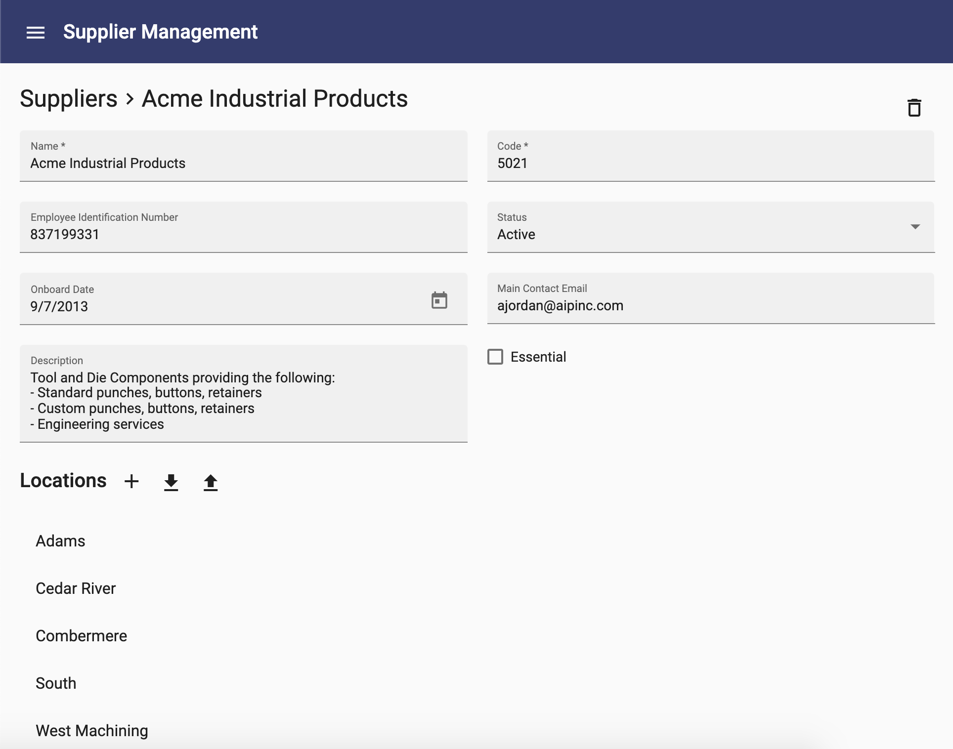
For example, the pages below were automatically created simply by defining 4 business objects. They required no additional configuration or code beyond defining each business object and the properties within them.
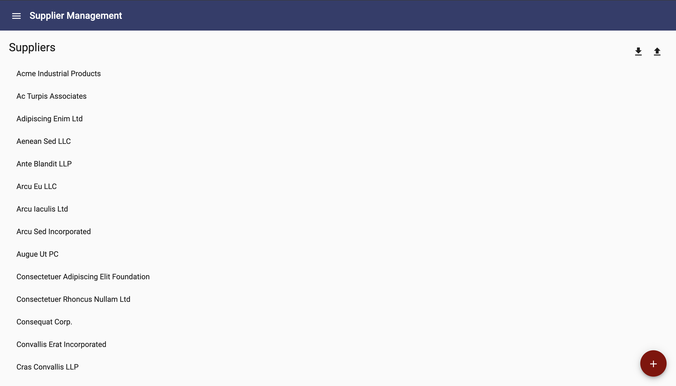
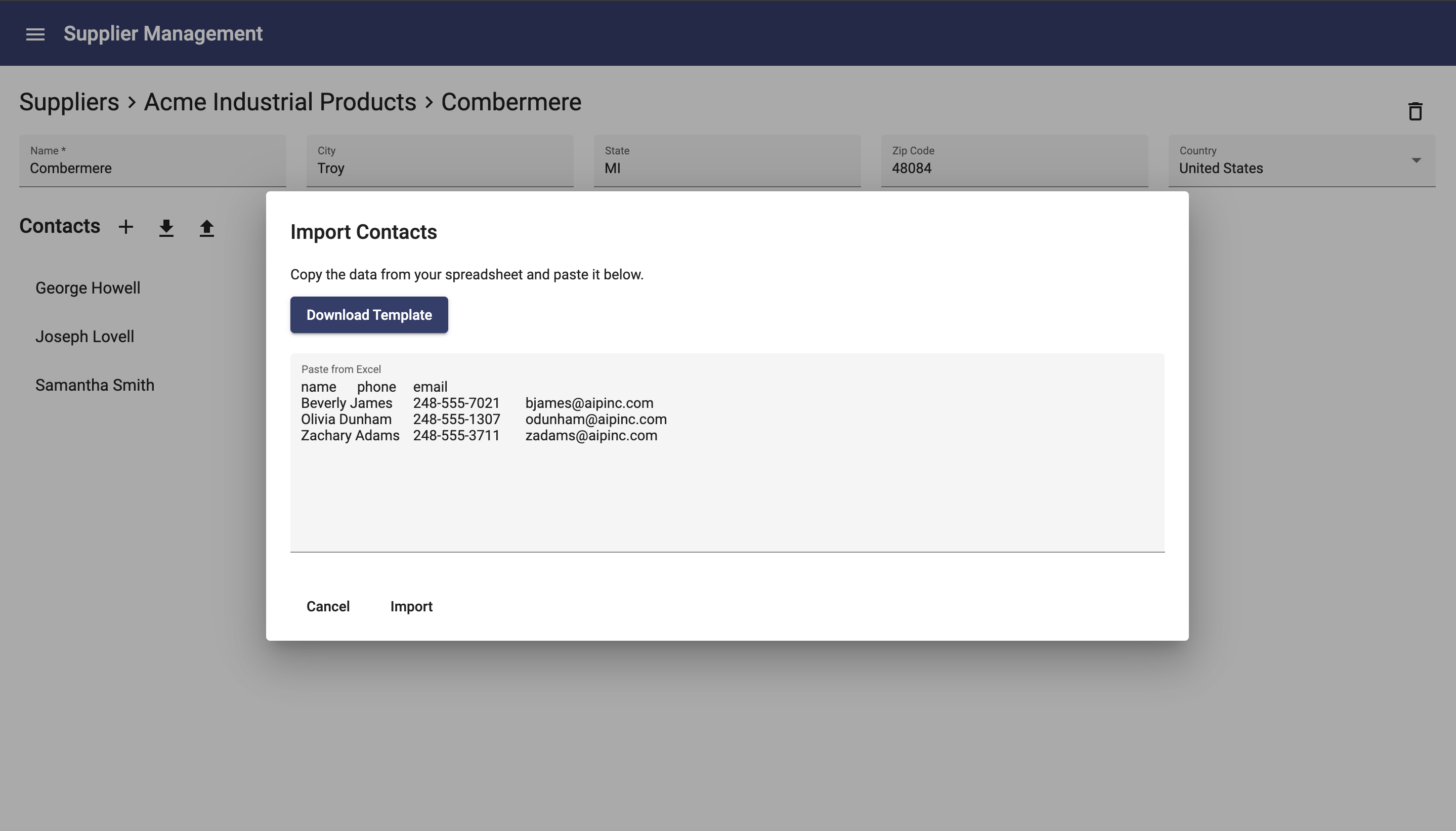
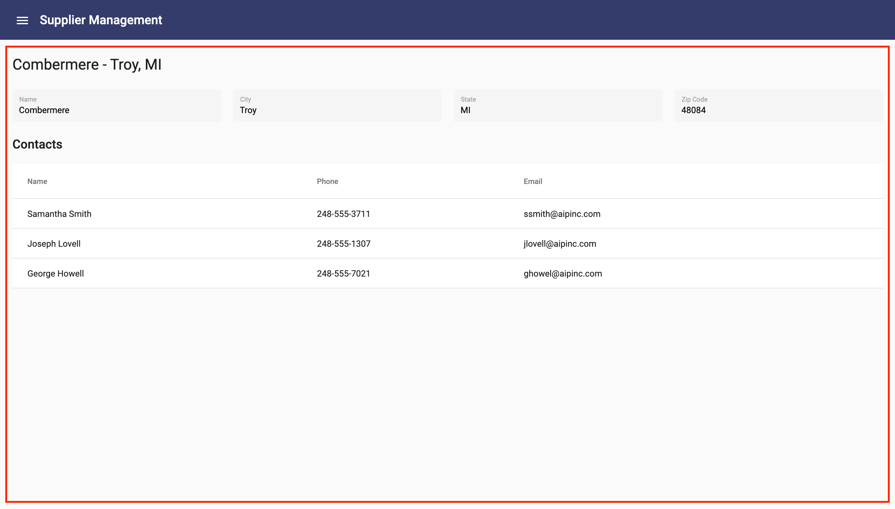
For list pages, such as the Suppliers page above, the dynamic page shows the title based on the name of the business object. This is followed by the list of every item stored within the business object where you can select one to navigate to the page for it. In the upper right corner are import/export buttons for importing and exporting from Excel. In the lower right corner is an add button to add one supplier.
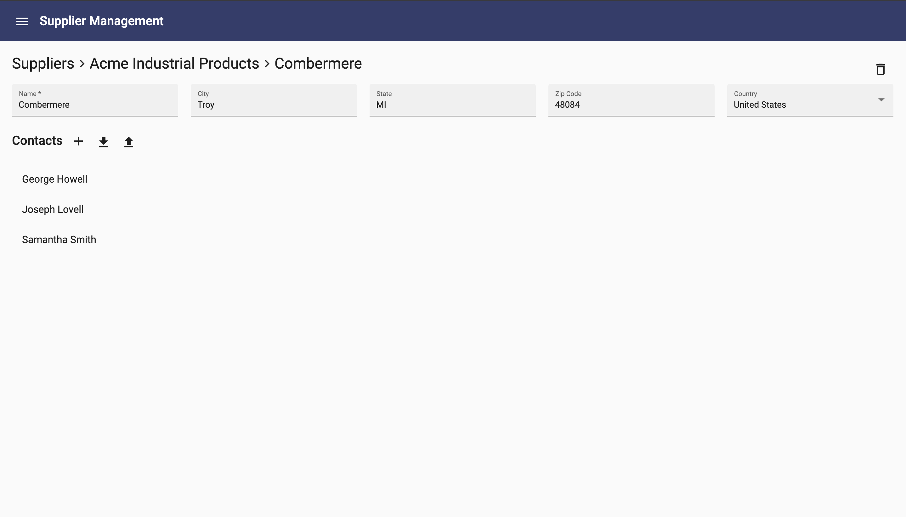
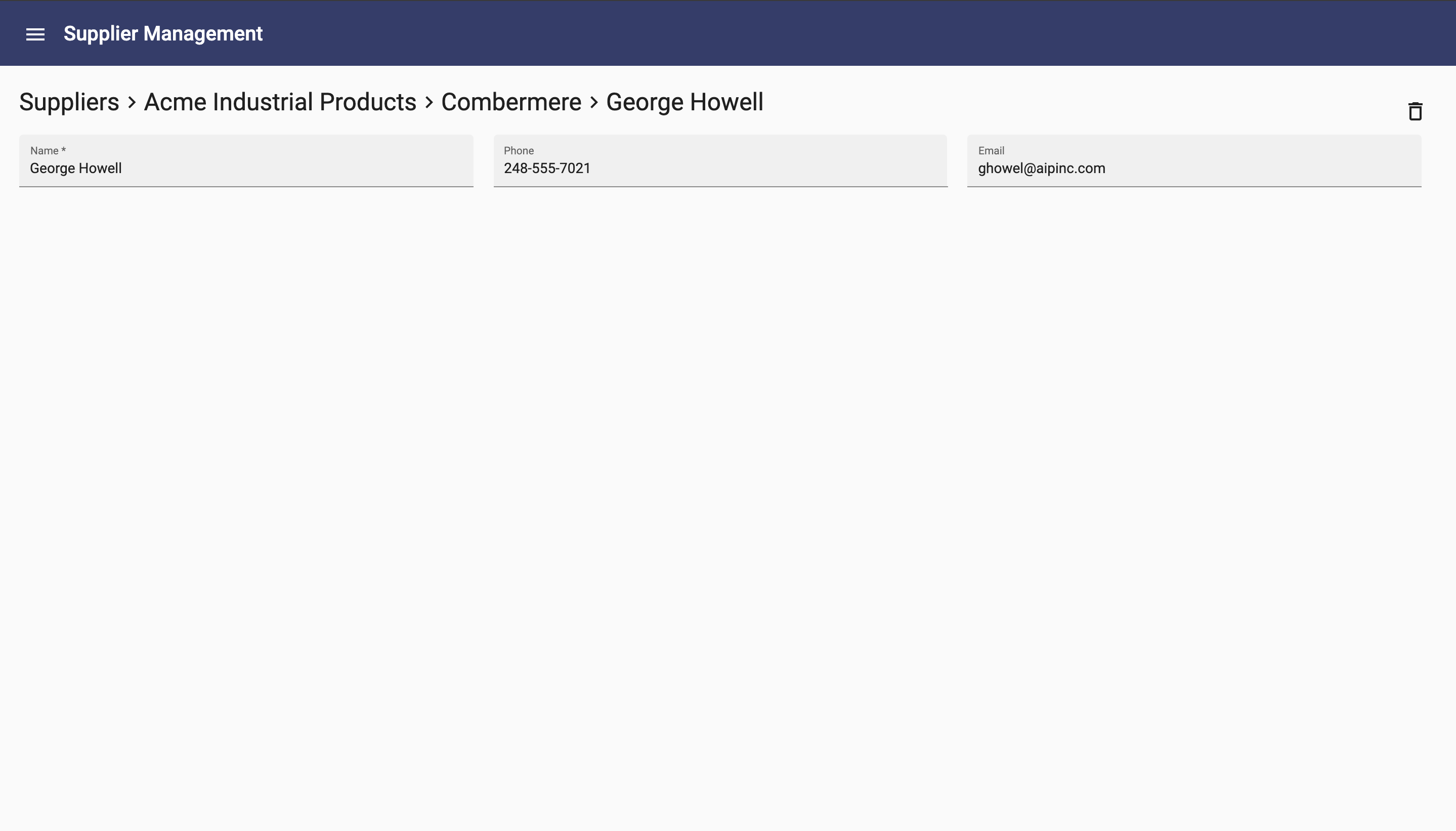
For singular pages that show one object, such as the Supplier page, it shows the title as a breadcrumb that allows navigation. Then, each field of the supplier is shown. Data for child objects are shown below, much like they are shown on a list page, allowing adding, importing, exporting and selecting one to navigate to that child.
Dynamic pages are made possible with the help of metadata driven components.
Metadata Driven Components
The library contains user interface components that know how to handle presenting your data. These include components to show one or more fields of a business object, components to show lists of items and components for navigating to related data. Let's walk through some examples.
Fields and Field
The Fields component displays all of the parameters of a business object. Although you can configure it further, the simplest way to use the Fields component on a UI is to just set the object attribute to your object:
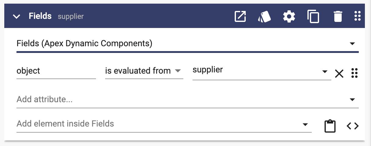
The component handles displaying each field that is appropriate for the data.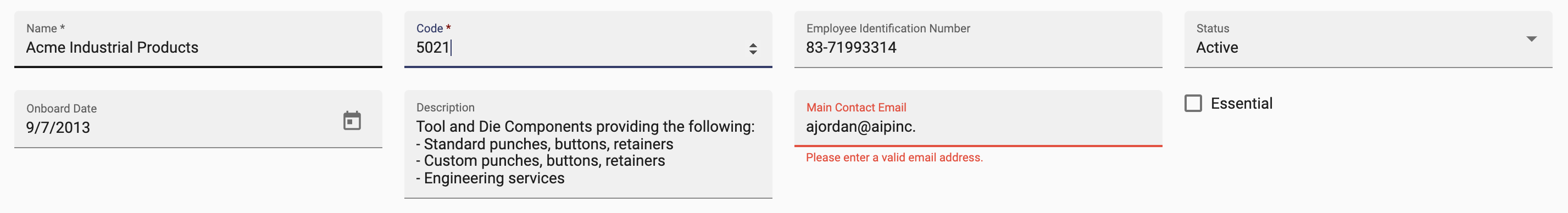
The Fields (plural) component uses a Field (singular) component for each property in an object. These Field components present data based on the type of property. If a property of the object is text, a text field is used; if a property is an email address, an email address field is used; etc.
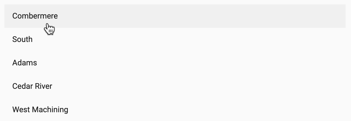
Nav List
Another example is Nav List. Similar to Fields, the simplest configuration is to pass a property to Nav List. In this case, however, Nav List needs an array of things. In this example, a list of locations.
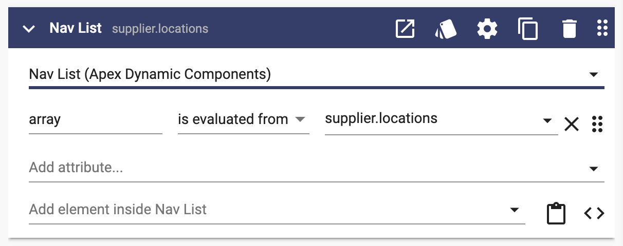
Nav List shows a list of the items with the ability to navigate by selecting one. In this example, selecting a location will navigate to the Location page for the one selected.
Over 50 components in the Dynamic Components library are metadata driven.
Layered Overrides
A powerful capability of Dynamic Components is the ability override parts or all of a component. You can use overrides to customize fields, display names or entire pages.
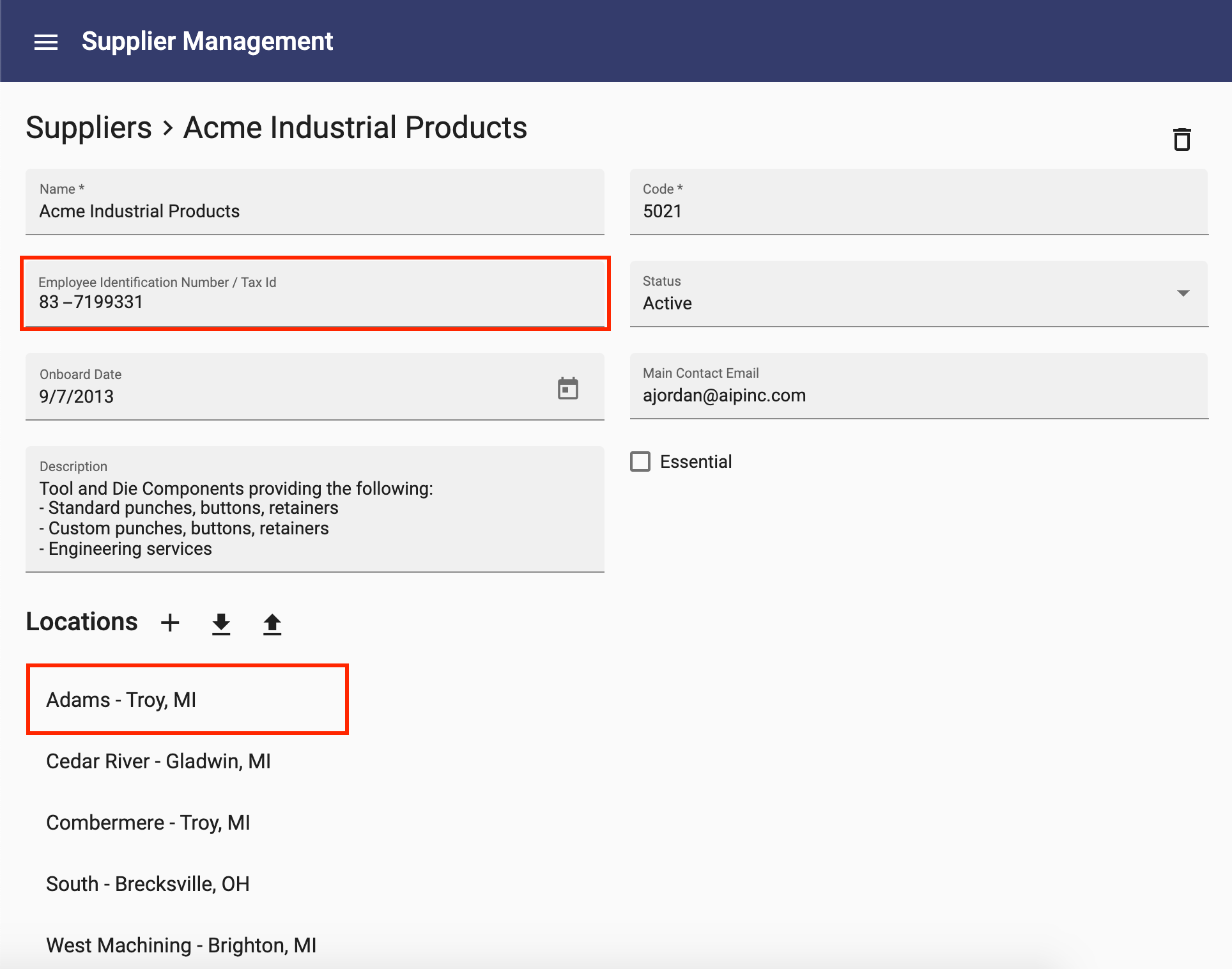
In the example below, the page on the left was dynamically generated with no customizations. The page on the right includes two overrides:
- Field Override: On the left, a text field was automatically used for the Employee Identification Number field based on the definition in the business object. On the right, you can see that this was overridden with a custom field.
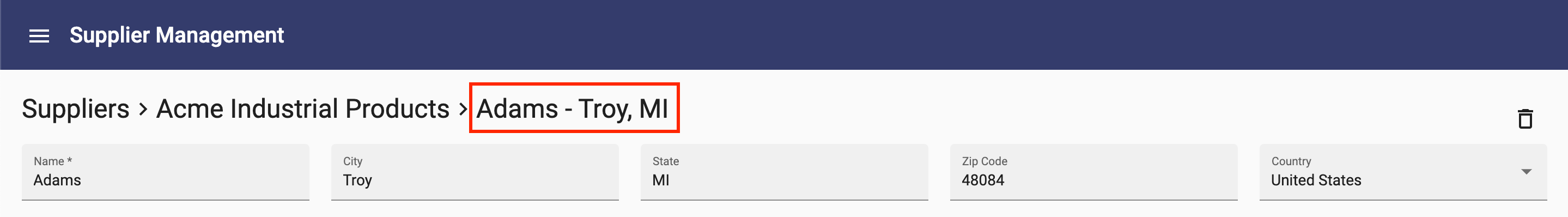
- Display Name: The list of locations on the left shows only the name for each location. On the right, the display name is customized to include the city and state.
Notice that everything else on the page remains the same.
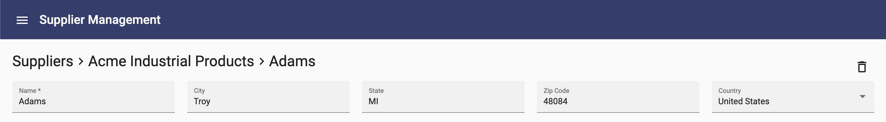
In both of these examples, the overrides apply to other pages or components that they are used. Since display names are used in several places, this override is applied wherever the Location display name is used. For example, notice the breadcrumb on the Location page below. The default is shown on the left, while the customized display name on the right includes the city and state:
These customizations were added by adding two user interface components to the project:
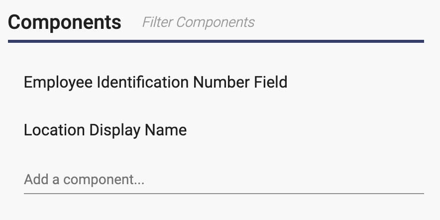
The first component is an example of a Field Override. The second is a Display Name override.
Field Override
To override a field, create a component named the same as the property followed by "Field". In the example above, the component is Employee Identification Number Field. Anywhere the property is displayed, it will use this custom field.
To only override a field for one specific business object, prefix the field with the name of the business object. For example, by naming this field Supplier Employee Identification Number Field, only user interfaces for the Supplier business object will have the field overridden.
An easy way to customize a field is to copy one of the fields from the library, paste it into your project, then rename and modify it.
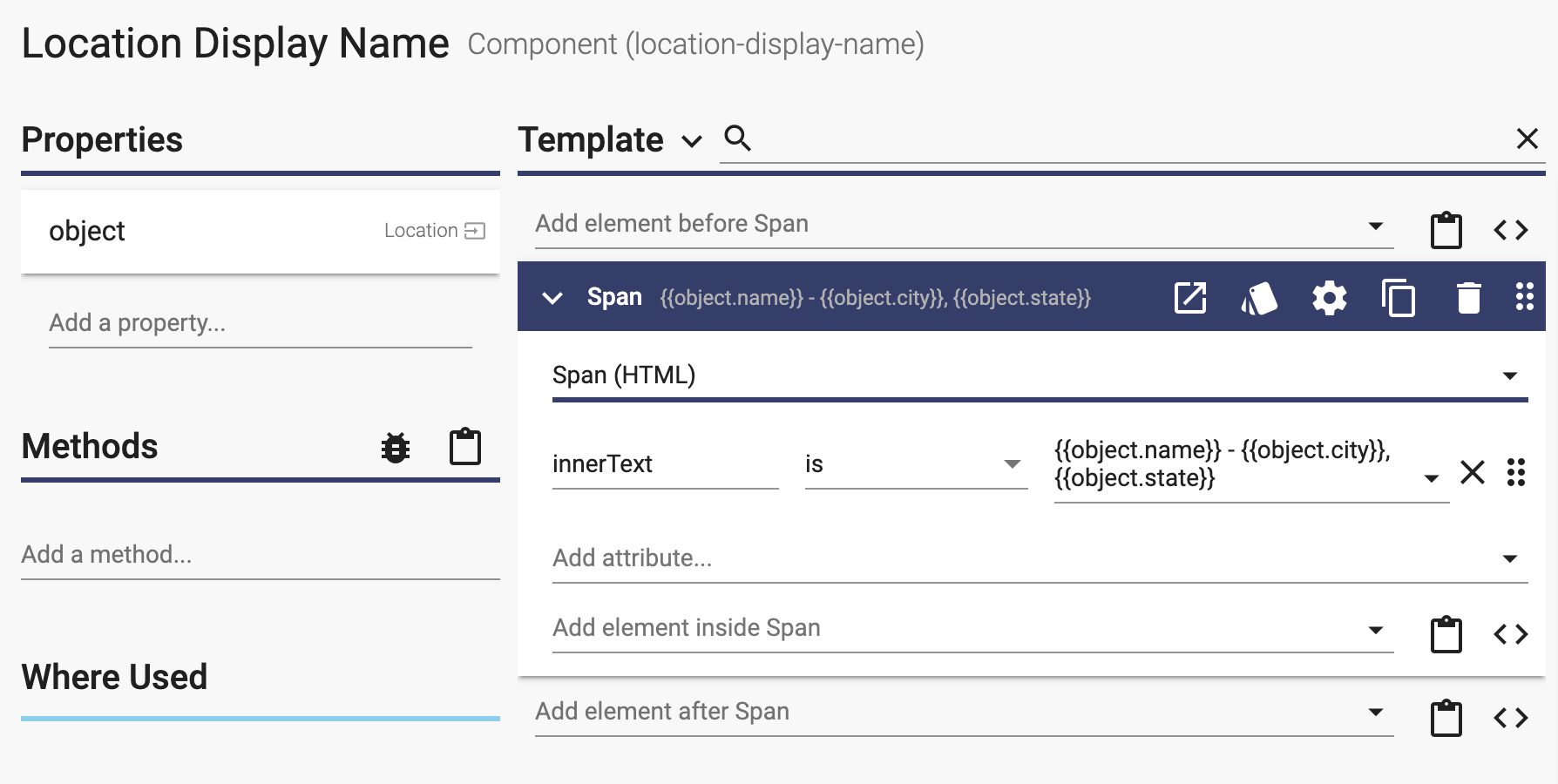
Display Name Override
A display name is the name shown as the title where a business object is used. By default, the first parameter of an object is shown in the display name. In the example above for Location, the default was the name of the location. To override a display name, create a component with a prefix of the business object, followed by "Display Name". In the example above, the component is Location Display Name. Here is the component for that example:
Page Override
Entire pages can also be overridden. To override a page, create a page named after the business object, either in singular or plural form, for example, Location or Locations. In the example below, the Location page on the left is the dynamically generated page, while the Location page on the right is completely overridden:
By applying layered overrides like the ones above, you can apply targeted specialization to your user interfaces. This lets you leverage the automatically built pages and components while incrementally making customizations that your app may need.
You have seen these concepts in action, now give them a try.
Components
The table below includes all of the components within the Dynamic Components library.
| List (Array) | List Actions | Object | Field | Layout |
| Accordion | Add Button | Delete Button | Autocomplete Field | App |
| Action List | Add Dialog | Display Name | Belongs To Field | Breadcrumb |
| Nav List | Add Field | Edit Button | Boolean Field | Column |
| Objects Page Content | Advanced Filter | Edit Dialog | Country Field | Message Dialog |
| Table | Columns Chooser | Fields | Currency Field | Path Breadcrumb |
| Export Button | Object Page Content | Date Field | Row | |
| Export Many Button | Date Range Field | Section | ||
| Export Tsv Button | Date Time Field | Wrap | ||
| Import Button | Date With Fixed Timezone Field | |||
| Import Tsv Button | Field | |||
| Import Tsv Dialog | Integer Field | |||
| Refresh Button | Multiline Field | |||
| Search Bar | Number Field | |||
| Object Autocomplete Field | ||||
| Select Field | ||||
| State Field | ||||
| Select Object Field | ||||
| Text Field |