

Apex Designer and Angular Material do a pretty good job for most cases, but if needed, you can style the components in a user interface.
Class
You can add a class to any component to add style to it. For example if you have an add supplier button that you need to position at the bottom right corner of the Suppliers page, you can add a class to the button and then add styles to that class by clicking on
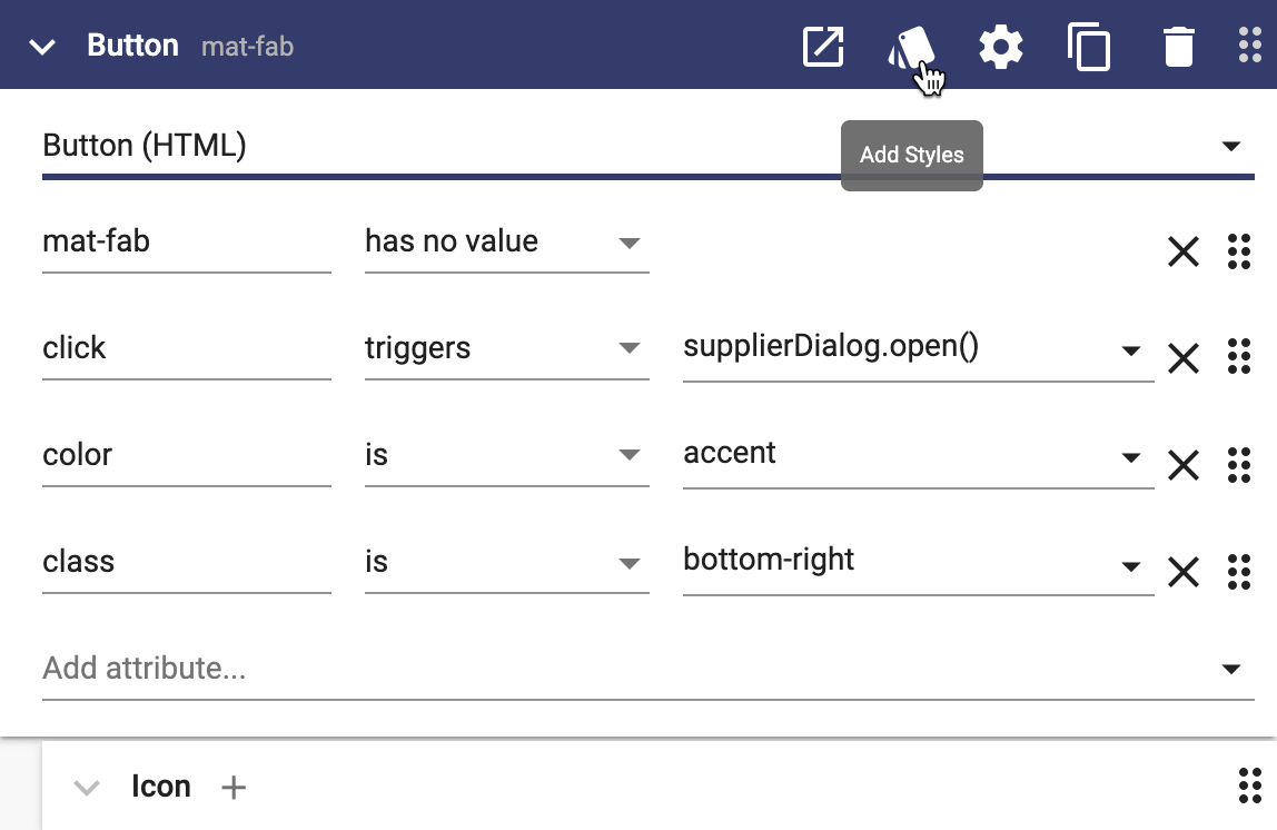
In the Styles dialog, define the class like this:
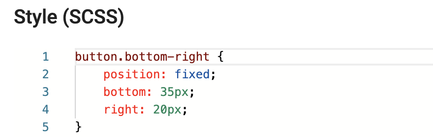
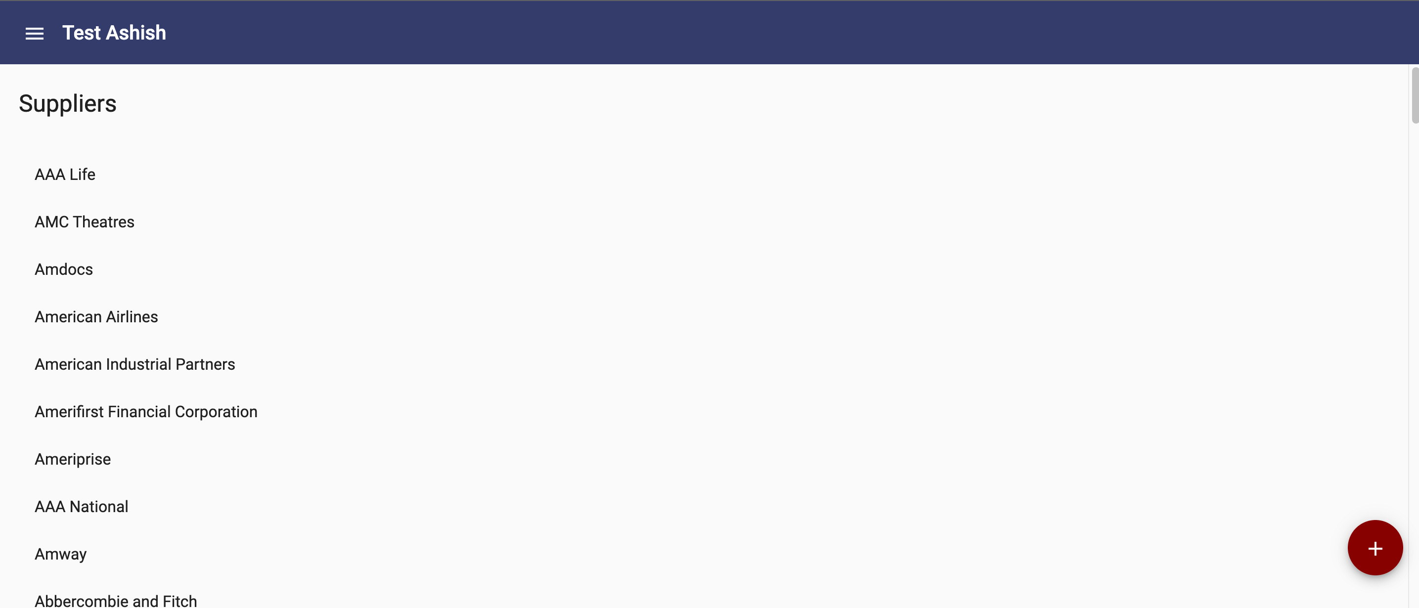
At runtime, the add button will now be positioned at the bottom right corner of the page:
Conditional Class
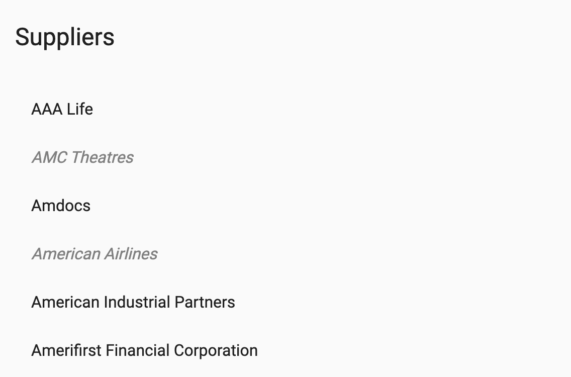
If you need to apply a class based on a condition, you can use ngClass directive. For example, if you need to show the inactive suppliers in a different font, you can use ngClass like this:
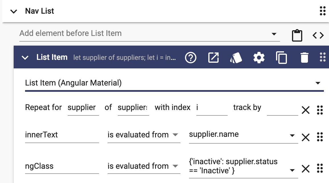
You can then add inactive class in the Styles dialog:
.inactive {
	color: gray;
	font-style: italic;
}
At run-time, it will look like this:
You can also have an if-else condition for ngClass like this:
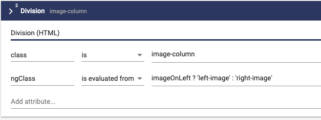
This will apply the left-image class if the boolean variable imageOnLeft is true, and the right-image class if it is false.
Styles can also be applied at the Project level. See Styles for more details.