

Project Styles allow you to define a theme for your application. Angular Materials' theming system lets you customize color and typography styles for components in your application. It is based on the Google Material Design specification. Apex Designer lets you define a global theme that will be used across the application unless it is overridden at a component level using CSS.
Angular Material Theme
Color Palettes
An Angular Material theme has five color palettes:
- Primary
- Accent
- Warn
- Foreground
- Background
Creating a custom color palette
Choose Three Colors
Find a website that you like and use Chrome inspect to find the color codes you want to use for the primary, accent and warn colors. For this example, I will use:
- Primary: #513bb3
- Accent: #13bc75
- Warn: #d11dd1
Generate the Palettes
There are several online tools that generate Material Design palettes. I will use the one at http://mcg.mbitson.com. When you open that url, there will be a default palette there. Change the name to whatever you want:
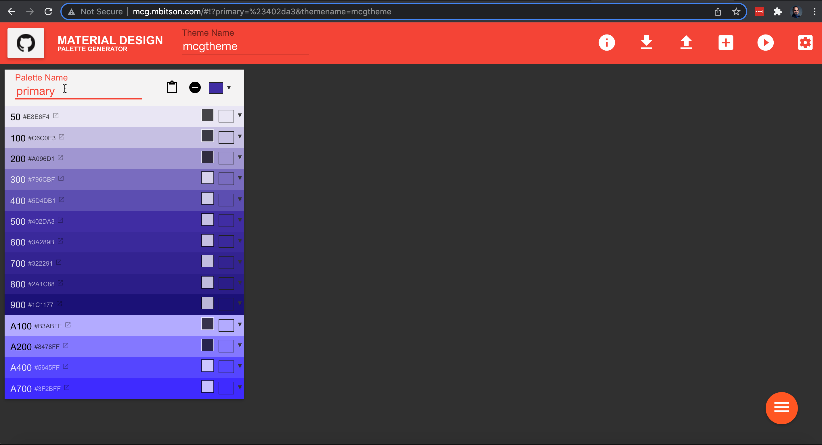
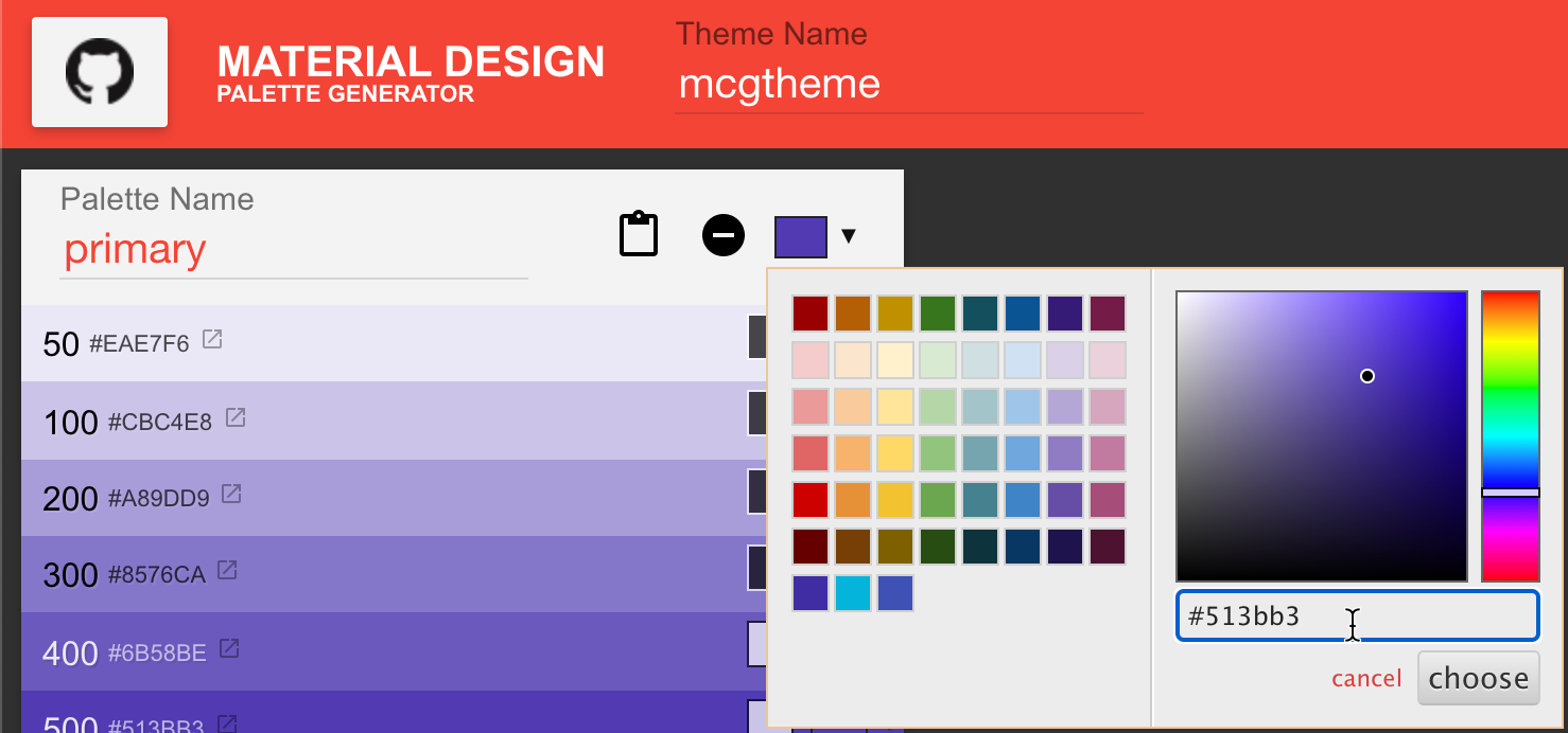
Then click the color drop down and paste in the primary color hex code #513bb3:
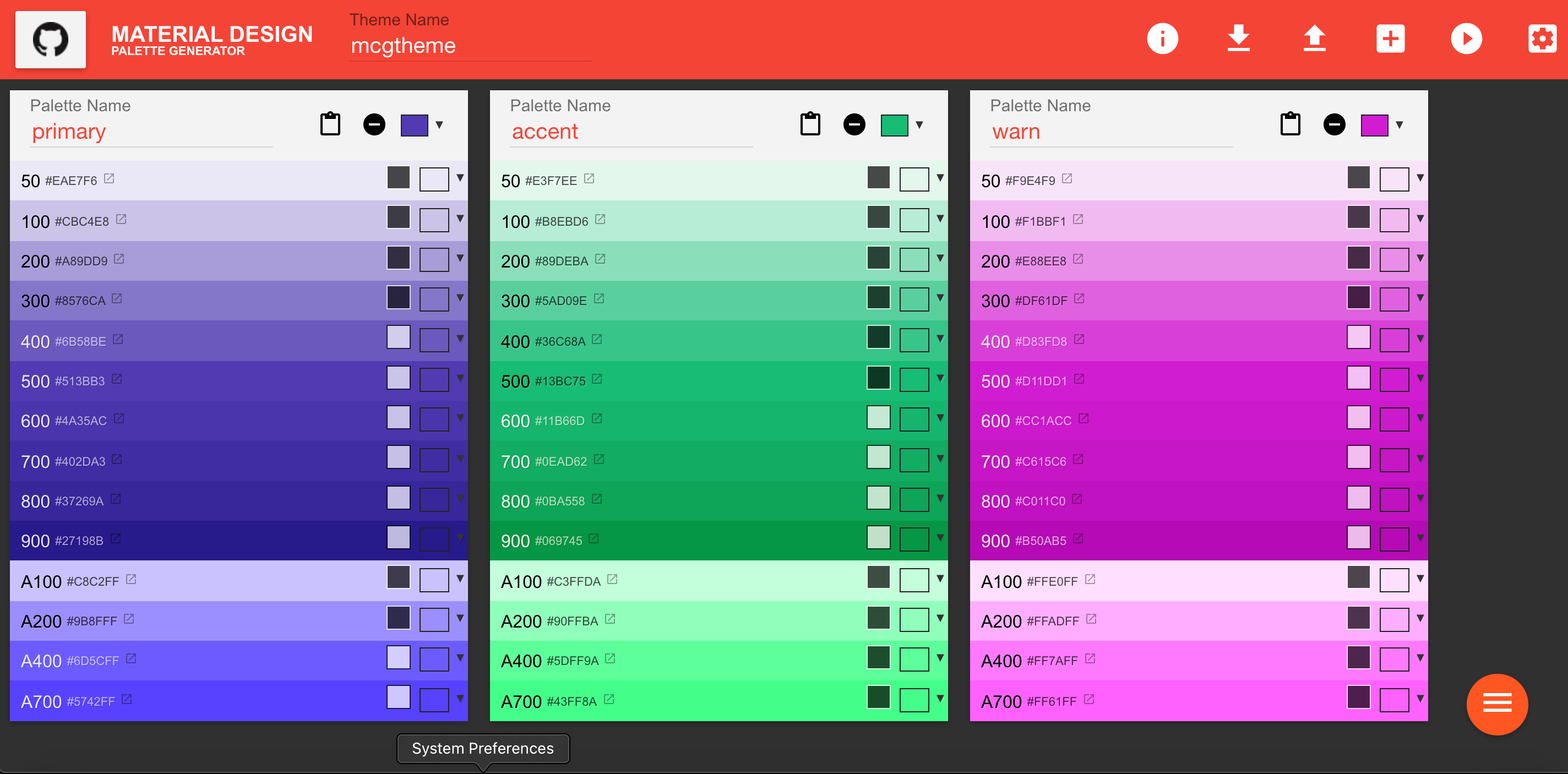
Click the menu icon and then add button to add a second palette. Rename it and change the color to the accent color #13bc75. Similarly, add a third palette warn with color #d11dd1:
Incorporate the Palettes
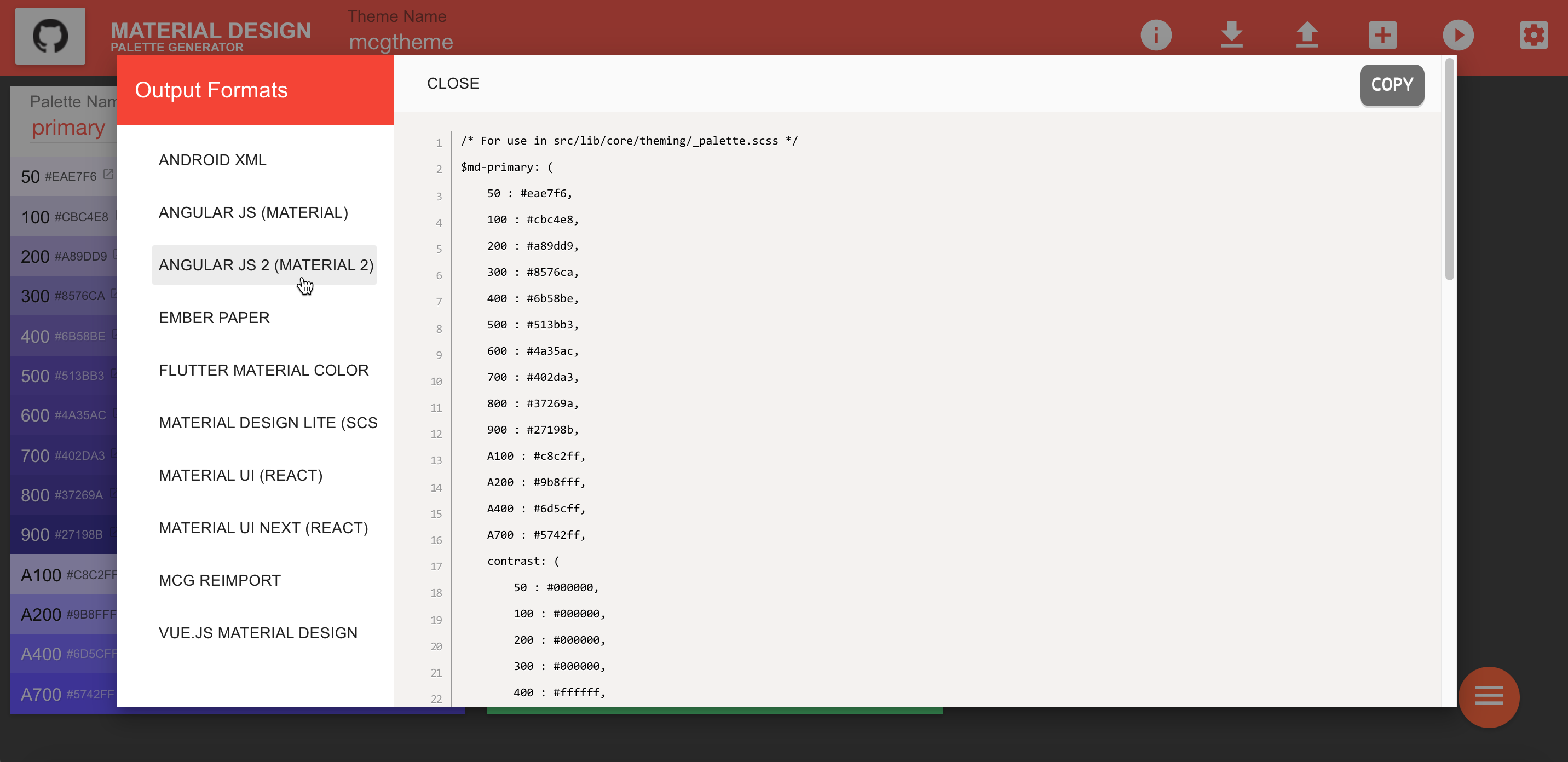
Click on the download icon and select the "ANGULAR JS 2 (MATERIAL 2)" side tab and then click the copy button:
Go to Project Settings + Styles (SCSS). Paste the palettes copied in the previous step:
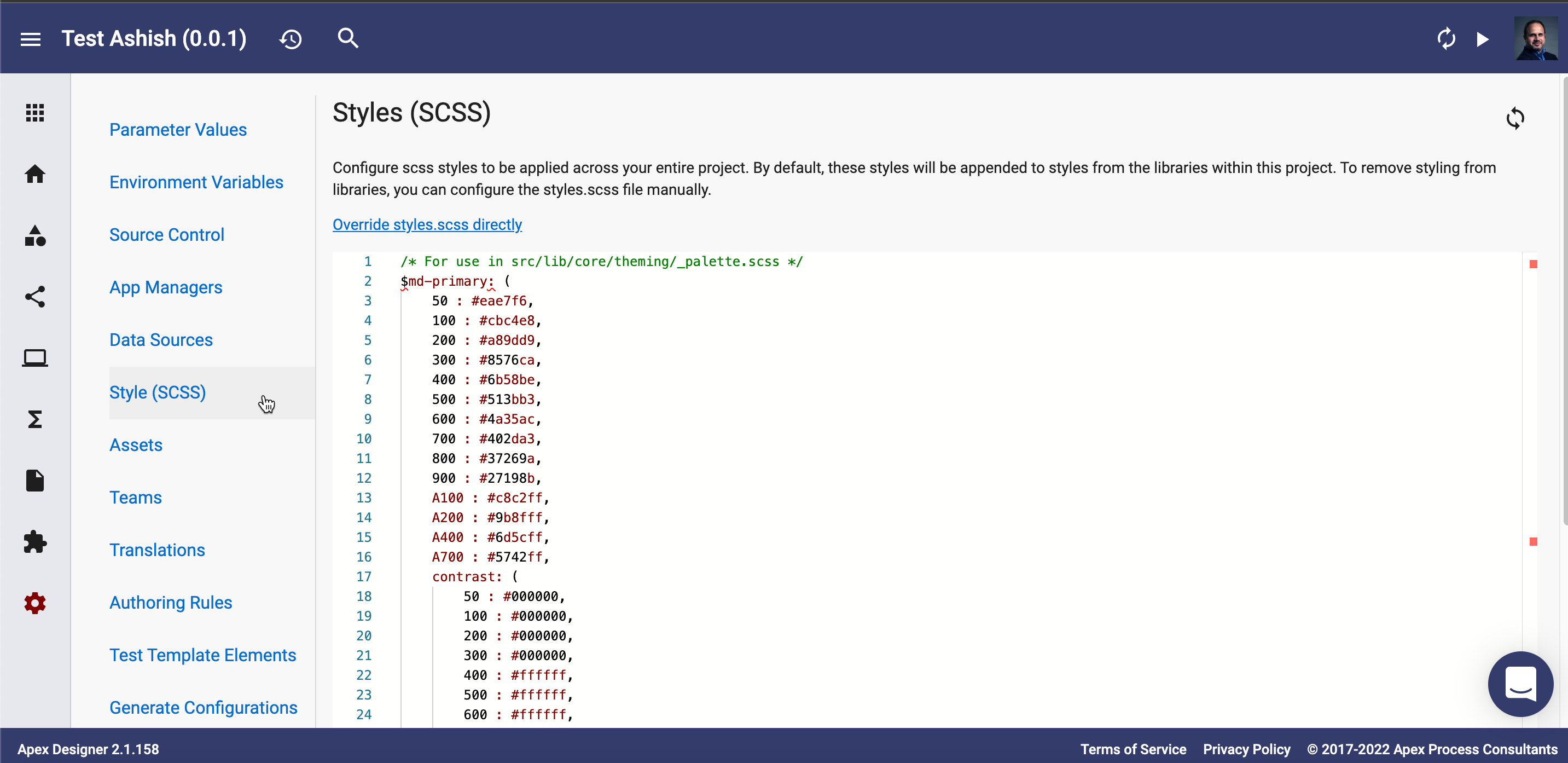
Add the following lines at the end of Styles:
$app-primary: mat-palette($md-primary);
$app-accent: mat-palette($md-accent);

// The warn palette is optional (defaults to red).
$app-warn: mat-palette($md-warn);

// Create the theme object (a Sass map containing all of the palettes).
$app-theme: mat-light-theme($app-primary, $app-accent, $app-warn);

// Include theme styles for core and each component used in your app.
@include angular-material-theme($app-theme);
Try it Out
Generate your app, check for a clean build and admire your fancy new color scheme!
Compounding themes between libraries and the app
If your app has multiple libraries, each library can have its own style definition. Then when the dependency is added to the app, the styles defined in the library are appended to the styles defined in the app. Library styles are appended in the same order as the dependencies are defined in the app.