

If a user interface page doesn't need to present certain information all the time, you can use a Material Dialog to show that information on demand. For example, a dialog can be used to add a new supplier or edit an existing supplier on a Suppliers page.
Create Dialog
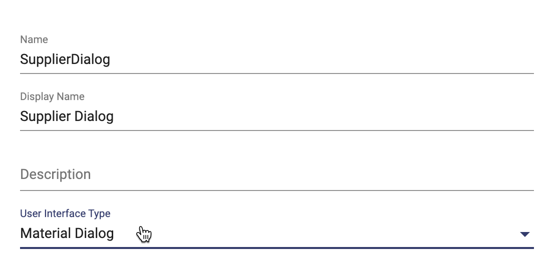
In Apex Designer a dialog is created as a user interface component. You can convert any component into a dialog by changing its type to Material Dialog in the user interface settings:
If you know that the component is going to be a dialog, you can add "dialog" as a suffix to the component name and it will automatically set its type as Material Dialog and will also create dialog structure in it.
Dialog Structure
A dialog's structure looks like this:
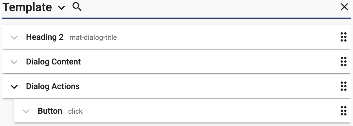
Heading
It has an attribute mat-dialog-title and is used for setting the dialog title.
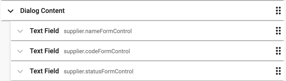
Dialog content
Dialog content is the primary scrollable content of the dialog under which you can add all the information that the dialog needs to display. For example, add all the supplier fields under dialog content, if the dialog is for adding a new supplier.
Dialog actions
Dialog actions is the container for action buttons at the bottom of the dialog. You can control the button alignment via the align attribute which can be set to end and center. The default button alignment is left.
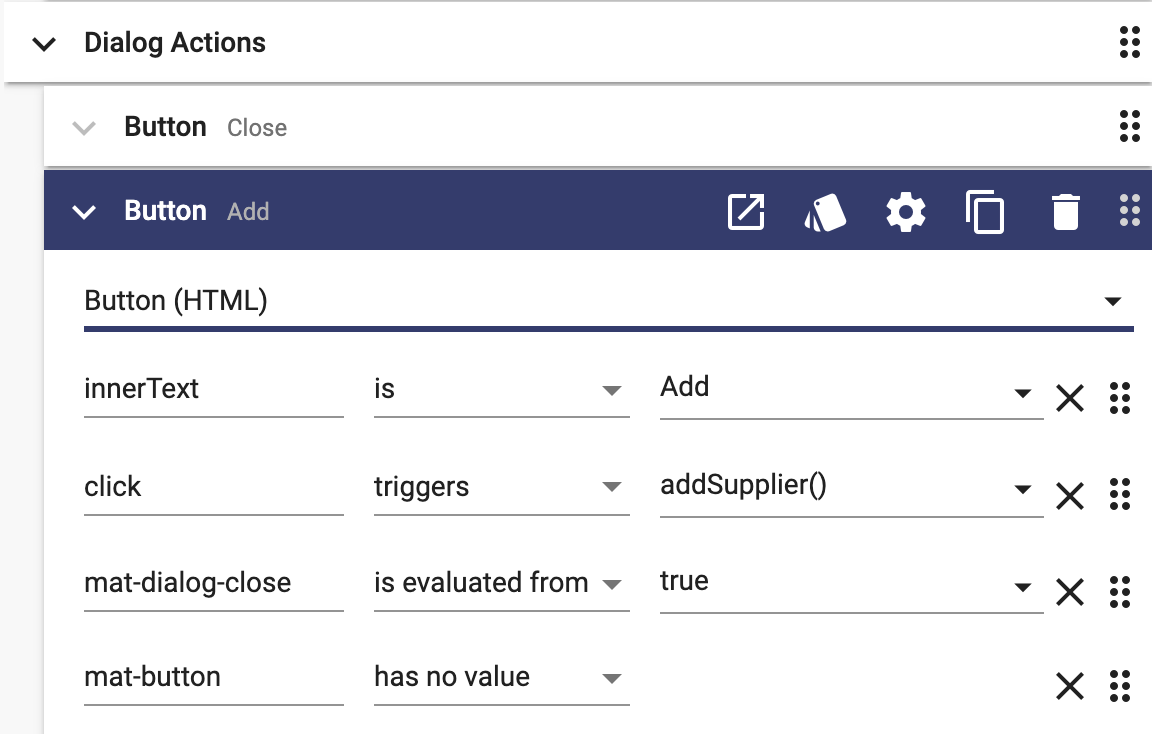
If you want to close the dialog automatically when an action button is clicked, you can add mat-dialog-close attribute to the button. If you need to close the dialog from a user interface method, you can do this:
this.dialog.close();Open Dialog
Once you have created a dialog, it needs to be added to a page. To add Supplier Dialog component to the Suppliers page, insert the dialog in the Suppliers page and assign a local name to it. You can then call dialog's open() method on a button click:
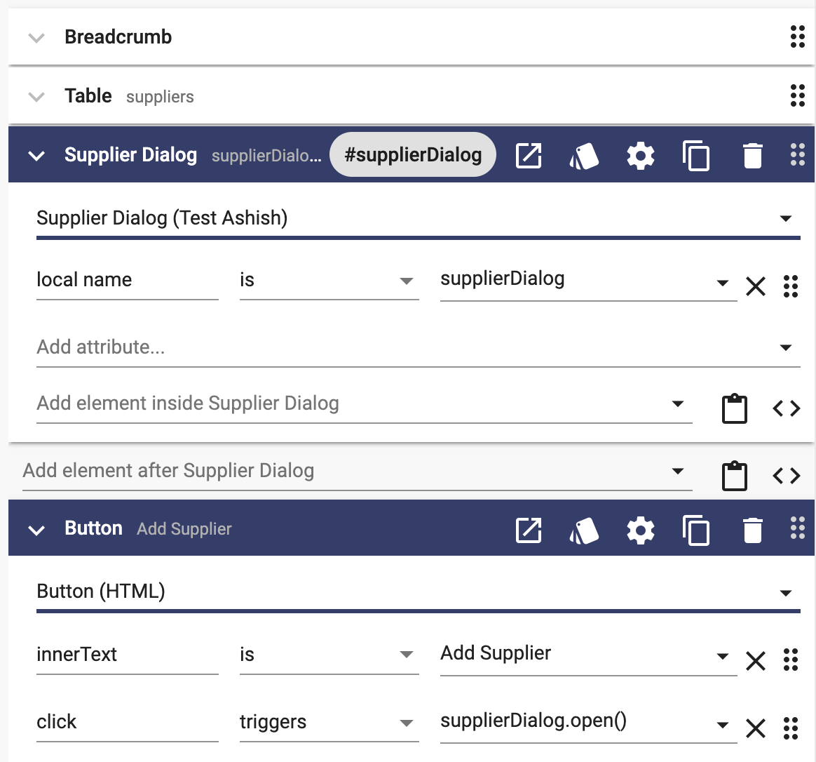
If you need to open the dialog from a user interface method, you do like this:
this.supplierDialog.open();Opening and Closing a Dialog with a Property
As an alternative to using a local name and the .open() method to open a dialog, you can bind the "isOpen" property of the dialog to a user interface property:
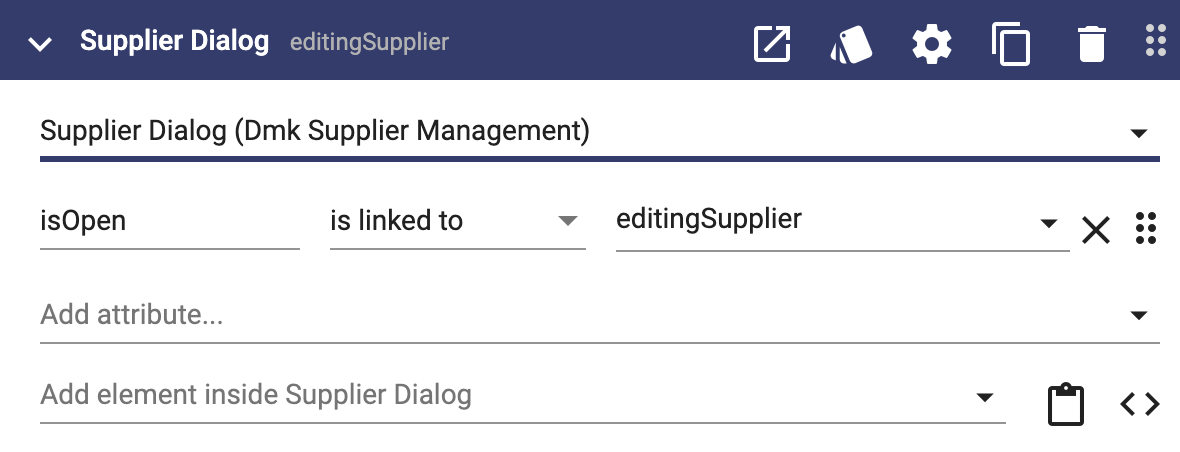
Setting the editingSupplier property to true will open the dialog. Setting it to false will close it. If the user closes the dialog, editingSupplier will be set to false.
Dialog Size (Width & Height)
By default a Material Dialog component automatically sizes itself to fit its content; however, that can lead to undesired sizing.
To specify the size of the dialog, just add a method to your Material Dialog component named "setSize". Set the method to be called automatically on load and enter this implementation:
this.dialog.updateSize('600px', '');The first argument is the width, and the second is the height. Possible values include '600px', '50%', or '90vw'. This example sets the width to 600 pixels and the height maintains default behavior. You can call updateSize more than once if you want to change the width and height dynamically.
Dialog Position
By default a Material Dialog component is centered horizontally and vertically. That is great when the dialog size does not change but if your dialog grows and shrinks, it will continuously recenter itself. That is not cool.
To specify the position of the dialog, just add a method to your Material Dialog component named "setPosition". Set the method to be called automatically on load and enter this implementation:
this.dialog.updatePosition({ top: '150px'});You can specify any of the properties defined in the DialogPosition class. This example sets the position once on load. You can call updatePosition more than once if you want to move the dialog around.
Force a Selection in a Dialog
A Material Dialog presents information to the user for action. The user can either click one of the buttons defined in the Dialog Actions or click outside the dialog to close it with no action. In some cases, you may want to prevent the user from closing the dialog without clicking one of your defined actions.
To prevent closing of the dialog when a user clicks outside the dialog, add a method to your dialog that runs on load to set this value to true:
this.dialog.disableClose = true;Stop Autofocus
By default a Material Dialog autofocuses the first field in the dialog content. In most cases this is fine but when the first field happens to be a typeahead, the autofocus makes the field show all the options when the dialog is loaded. To stop that from happening, you can set the following in a method that runs on load:
this.dialog.autoFocus = true;Moveable Dialog
By default Material Dialog has a fixed position, which can be changed through a method as shown above in the Dialog Position section, but the user cannot move the dialog on the screen. If the dialog is covering some information that a user needs to read, you can make the dialog movable by first setting the following in a method that runs on load:
this.dialog.disableClose = true;
this.dialog.hasBackdrop = false;
Then add cdk directives in the heading and add an icon that the user can use to drag the dialog around:
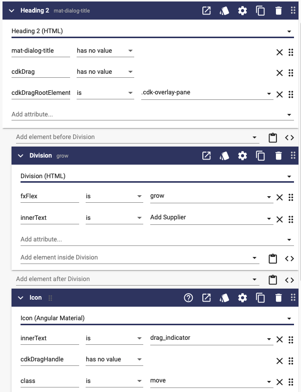
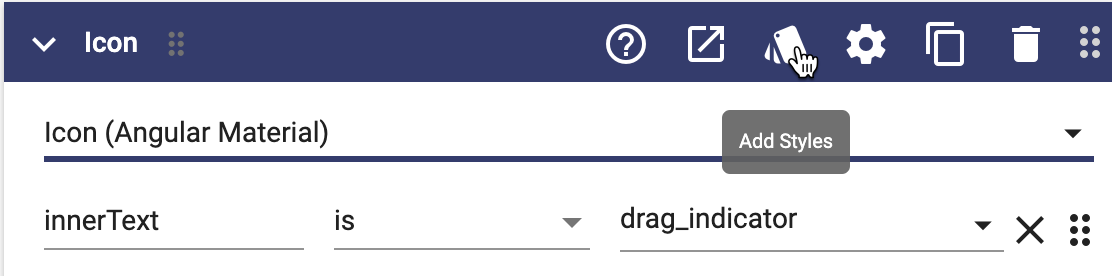
Lastly, change the cursor's style to move when the user takes the mouse on top of the drag icon:
.move {
	cursor: move;
}