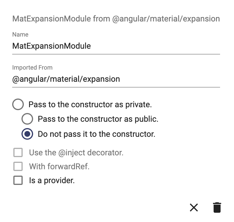
The basic elements that you use to create a user interface are defined as user interface components of type "External Component":
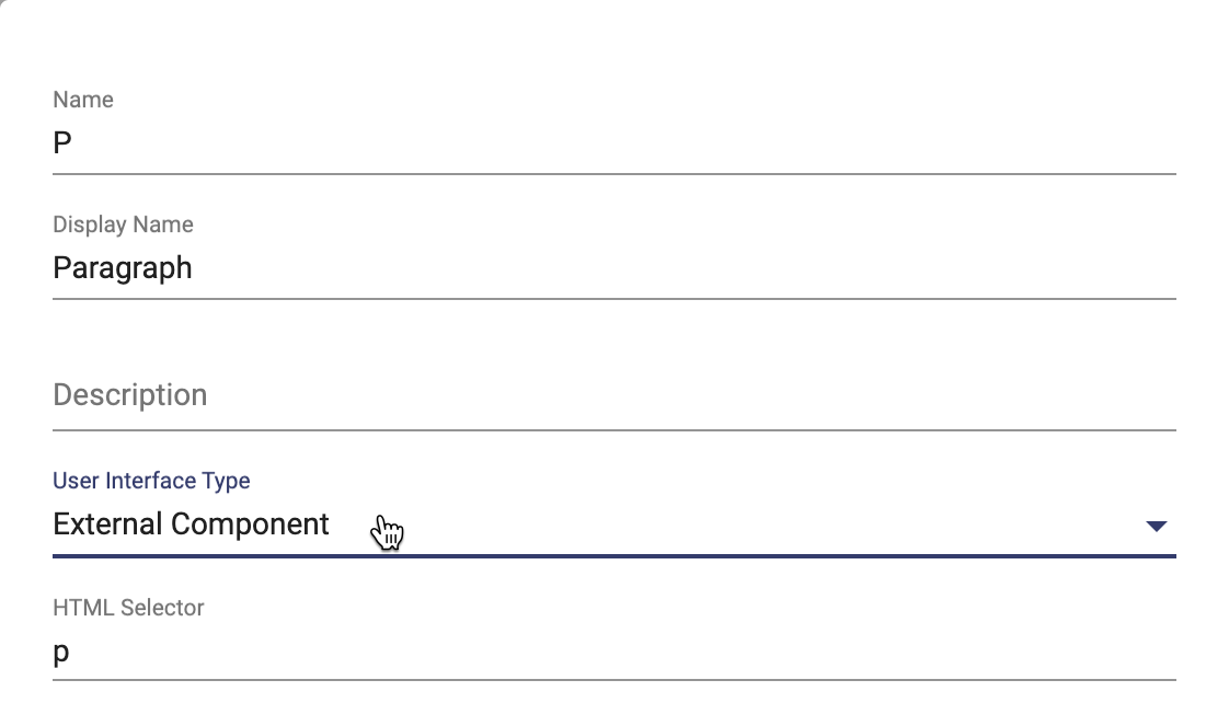
All of the HTML and Angular Material elements are already defined in the libraries that come with Apex Designer. But if you use an NPM package with new elements, you can manually create those elements as External Components.
Simple External Component - Paragraph
A paragraph element is part of the HTML library:
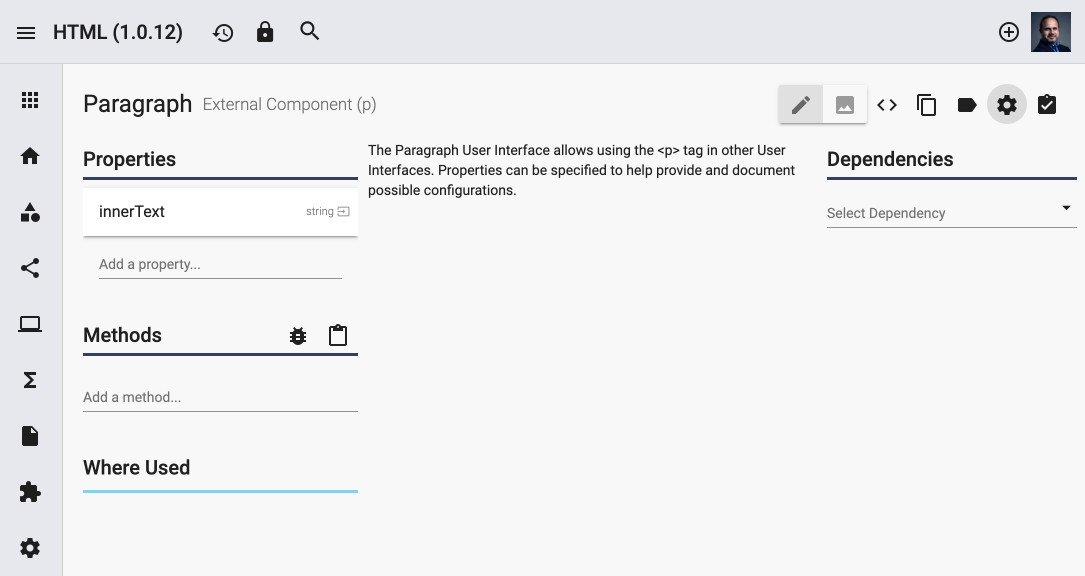
Paragraph's tag is set in the HTML Selector under settings. It can optionally contain properties, which show up under the external component when it is inserted in a user interface. In the user interface, you can still use a property that is supported by that external component but not defined in it. For example, you can add a "class" attribute to a paragraph even though it is not defined in the Paragraph External Component.
Complex External Component - Accordion
Accordion is an Angular Material element used as a container for multiple Expansion Panels - another Angular Material element. Accordion is defined in the Angular Material Library:

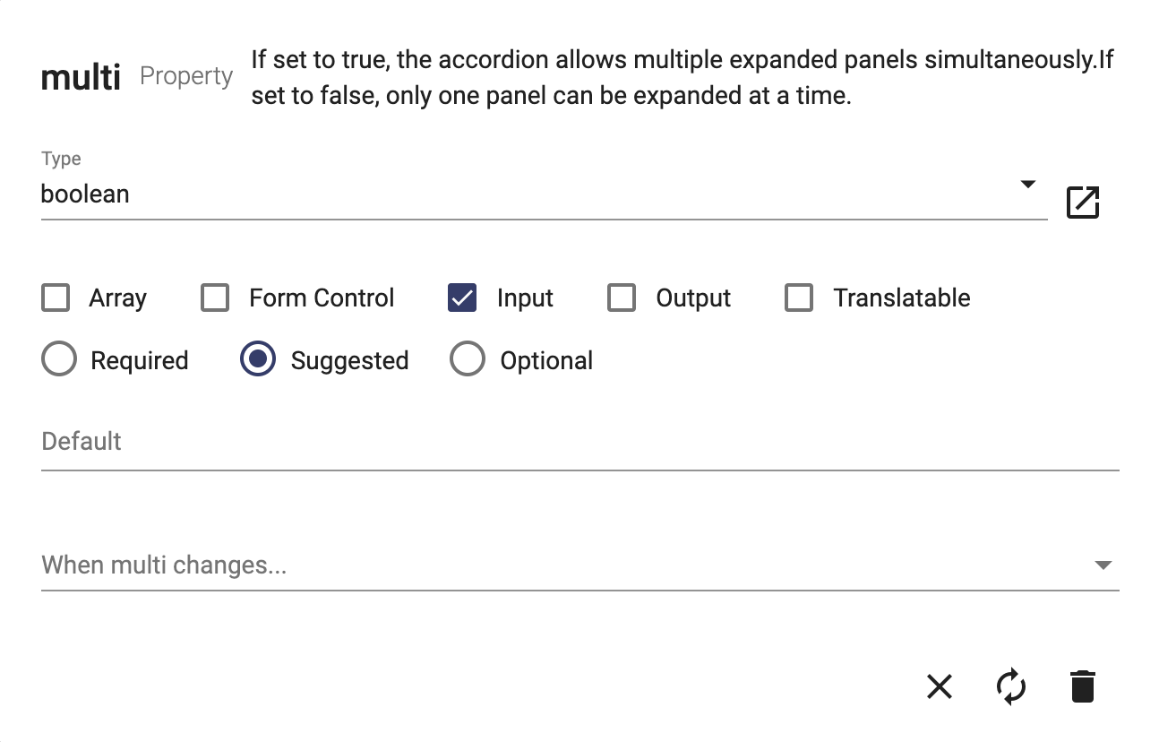
Accordion comes with a unique set of properties that were added with a description to help a user understand their purpose and/or usage. For example, "multi" property has a brief description about how the property can be used to control Accordion's behavior:
Accordion API reference on the Angular Material site shows that you need to import MatExpansionModule for it:
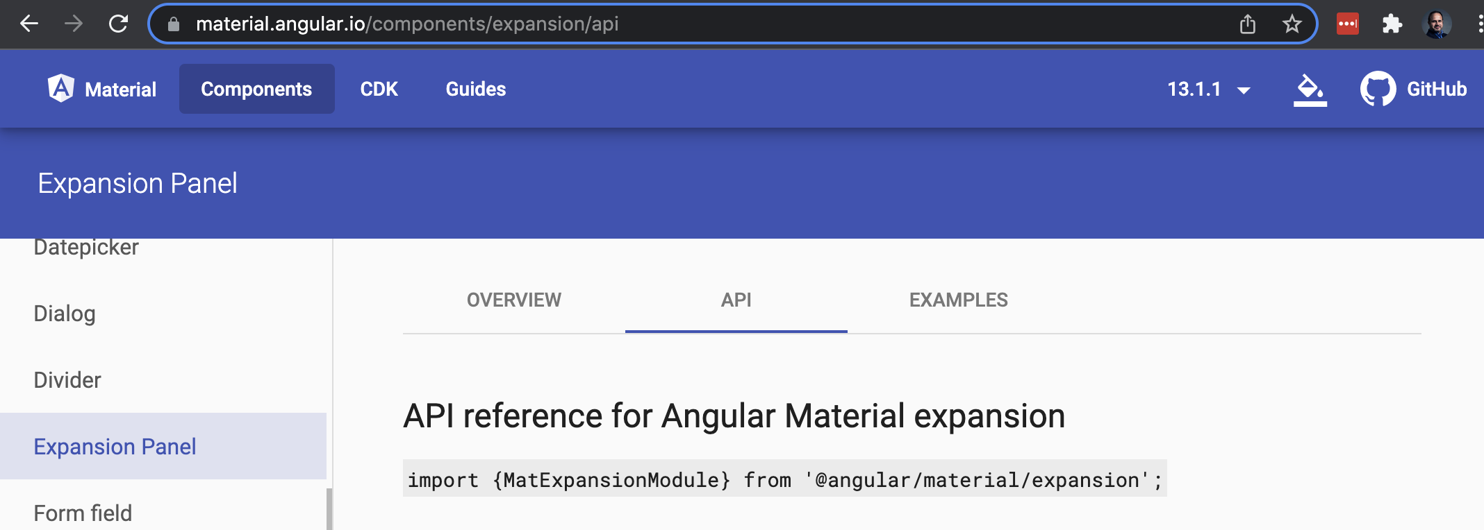
You can add MatExpansionModule as a dependency on the Accordion (see above the Accordion page screenshot). You can then click on the dependency to add its import path:
