You can define rules to simplify authoring in Apex Designer. Rules can help determine default attributes and preferred options for typeaheads.
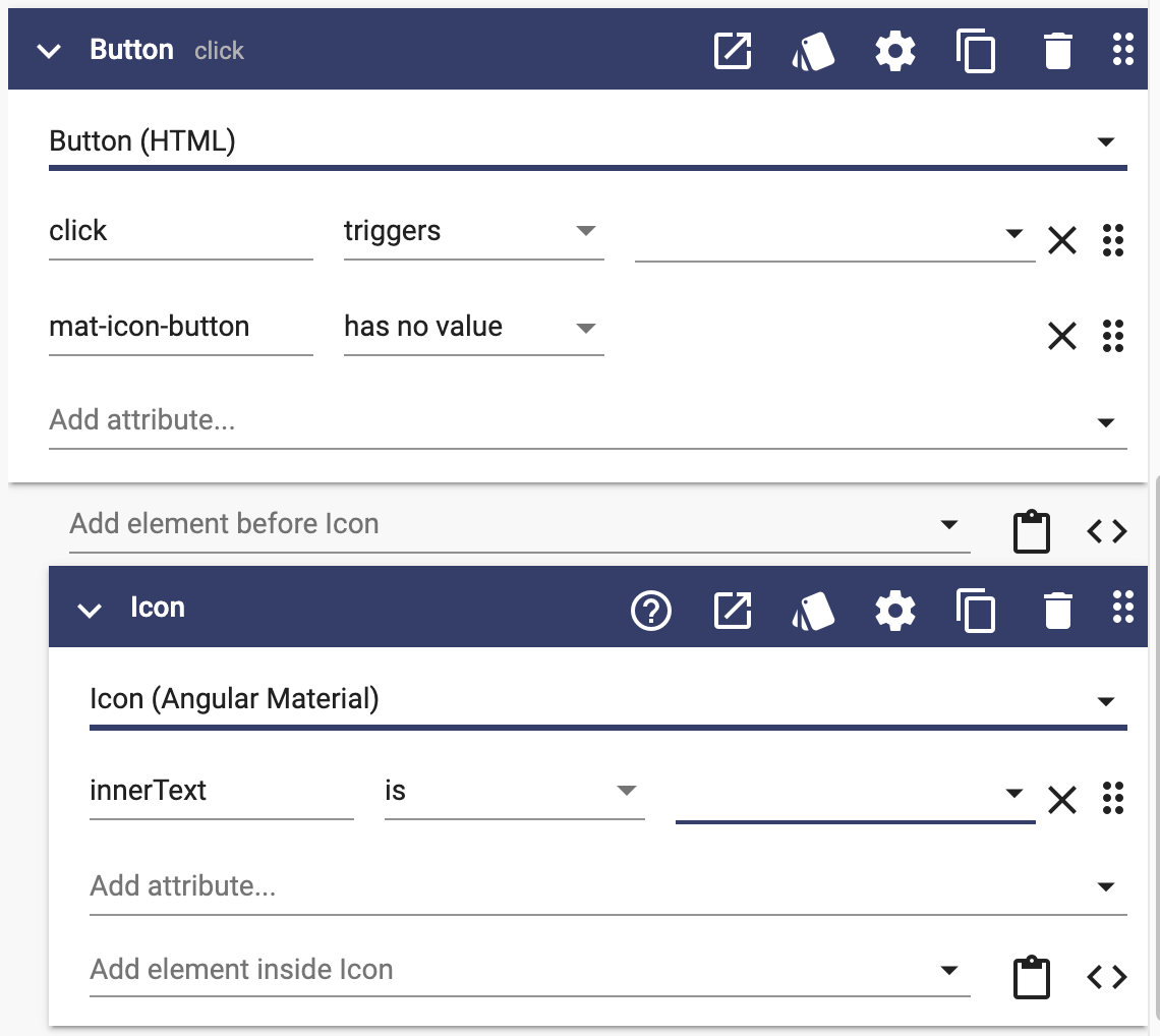
For example, when you add mat-icon-button directive to a button, an icon element is automatically put inside the button:
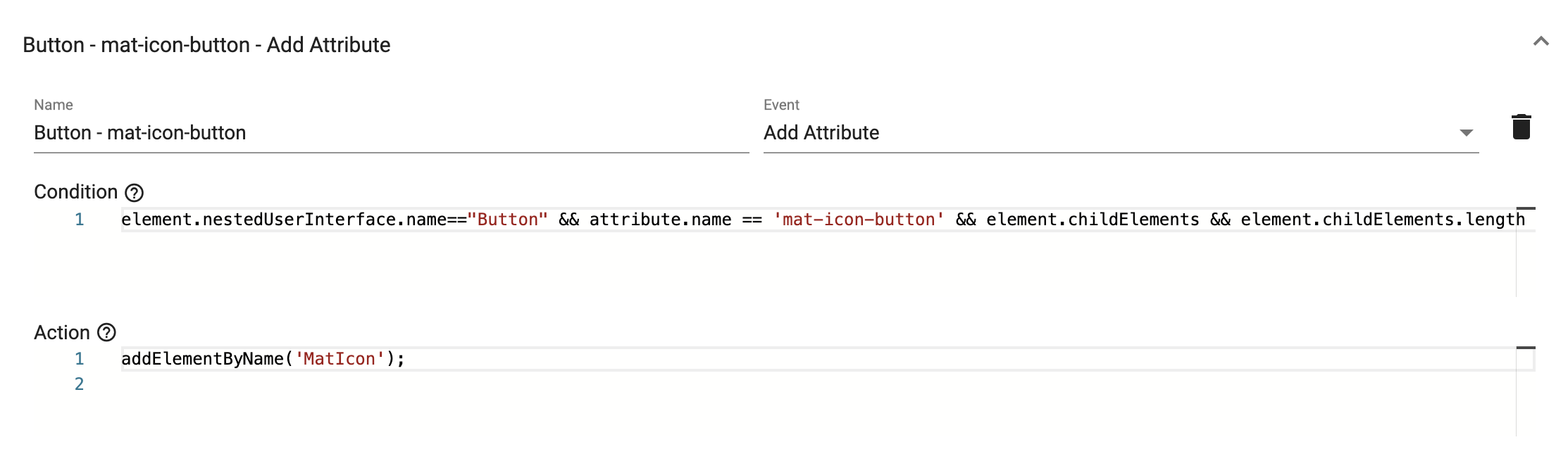
The above behavior is controlled by the authoring rule defined in the Angular Material Library:
Creating Rules
To create an authoring rule, go to Project Settings + Authoring Rules and click on the add button. When you add a rule, you can select an Event from the options provided. Each Event supports properties that can be used to validate a condition, and methods that can be called to perform a specific task.
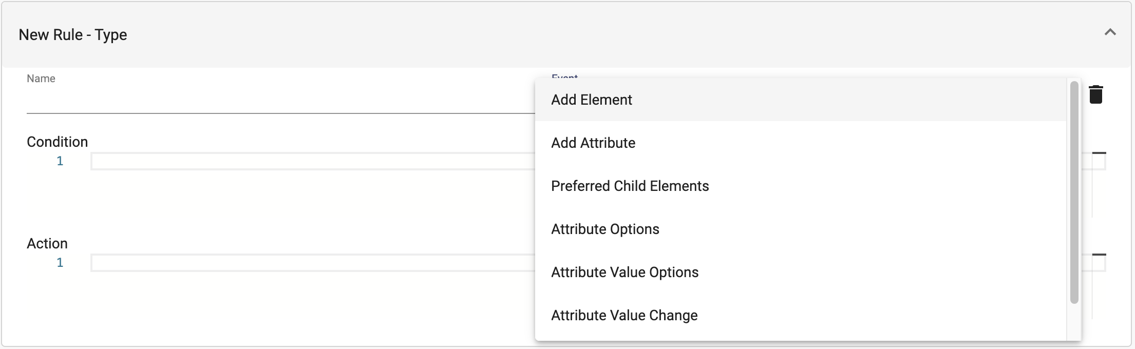
Possible Events
| Event | Purpose | Properties | Methods |
| Add Element | Called when a user interface element is added |
|
|
| Add Attribute | Called when an attribute is added to a user interface element |
|
|
| Preferred Child Elements | Set options for the "Add Element" typeaheads |
|
|
| Attribute Options |
Allows adding more options to the attribute typeahead |
|
|
| Attribute Value Options | Set options for attribute value typeaheads |
|
|
| Attribute Value Change |
Set options for attribute value typeaheads |
|
|
| Element Validation |
Called when an element is loaded or moved |
|
|
Properties Examples
| Properties | Example |
| attribute |
attribute.name == 'mat-icon-button'
|
| element |
element.nestedUserInterface.name=="Button"
element.childElements && element.childElements.length == 0
element.userInterface.wrapperType != 'MaterialDialog'
element.parentElement.nestedUserInterface.displayName == 'Template Table'
|
| newElement |
newElement.userInterface.wrapperType == 'MaterialDialog'
!newElement.parentElement
newElement.parentElement.attributes
|
| scope |
scope.userInterface.wrapperType == 'MaterialDialog'
|
| userInterface |
userInterface.displayName=='Accordion' userInterface.displayName.includes("Heading")
userInterface.name=='MatAccordion'
|
Method Examples
| Method | Example |
| addAttribute(name:string, bindingType:string, value:string) |
addAttribute('#auto', 'value', 'matAutocomplete'); |
| addElementByName(name:string) |
addElementByName('MatOption');
|
| addWarning(message:string, actions:function[]) |
addWarning("This component should be inside of a Card.", null);
|
| array.add() |
element.attributes.add({name:"confirmMessage",bindingType:"value",value:"Are you sure?"});
newElement.attributes.add({ name: 'matExpansionPanelContent', bindingType: 'no value' });
|
| hasAttribute(element:any, name:string) |
hasAttribute(element,'confirm')
|
| isParentName() |
isParentName("Card")
|
| setEventOptions(options:any[]) |
setEventOptions(['confirm', 'click', 'focus', 'blur']);
|
| setPreferredChildren(array:any[]) |
setPreferredChildren(['Expansion Panel'])
|
| setPreferredOptions(options:any[]) |
setPreferredOptions(['primary', 'accent', 'warn']);
setPreferredOptions([
{
name: 'routerLink',
attribute: { bindingType: 'value', name: 'routerLink' },
help: 'Link to the navigating page'
},
{
name: 'mat-button',
attribute: { bindingType: 'no value', name: 'mat-button' },
help: 'Creates a material style button'
},
{
name: 'mat-raised-button',
attribute: { bindingType: 'no value', name: 'mat-raised-button' },
help: 'Creates a material style raised button'
},
{
name: 'mat-fab',
attribute: { bindingType: 'no value', name: 'mat-fab' },
help: 'Creates a material style floating action button'
},
{
name: 'mat-mini-fab',
attribute: { bindingType: 'no value', name: 'mat-mini-fab' },
help: 'Creates a material style mini floating action button'
}
]);
|
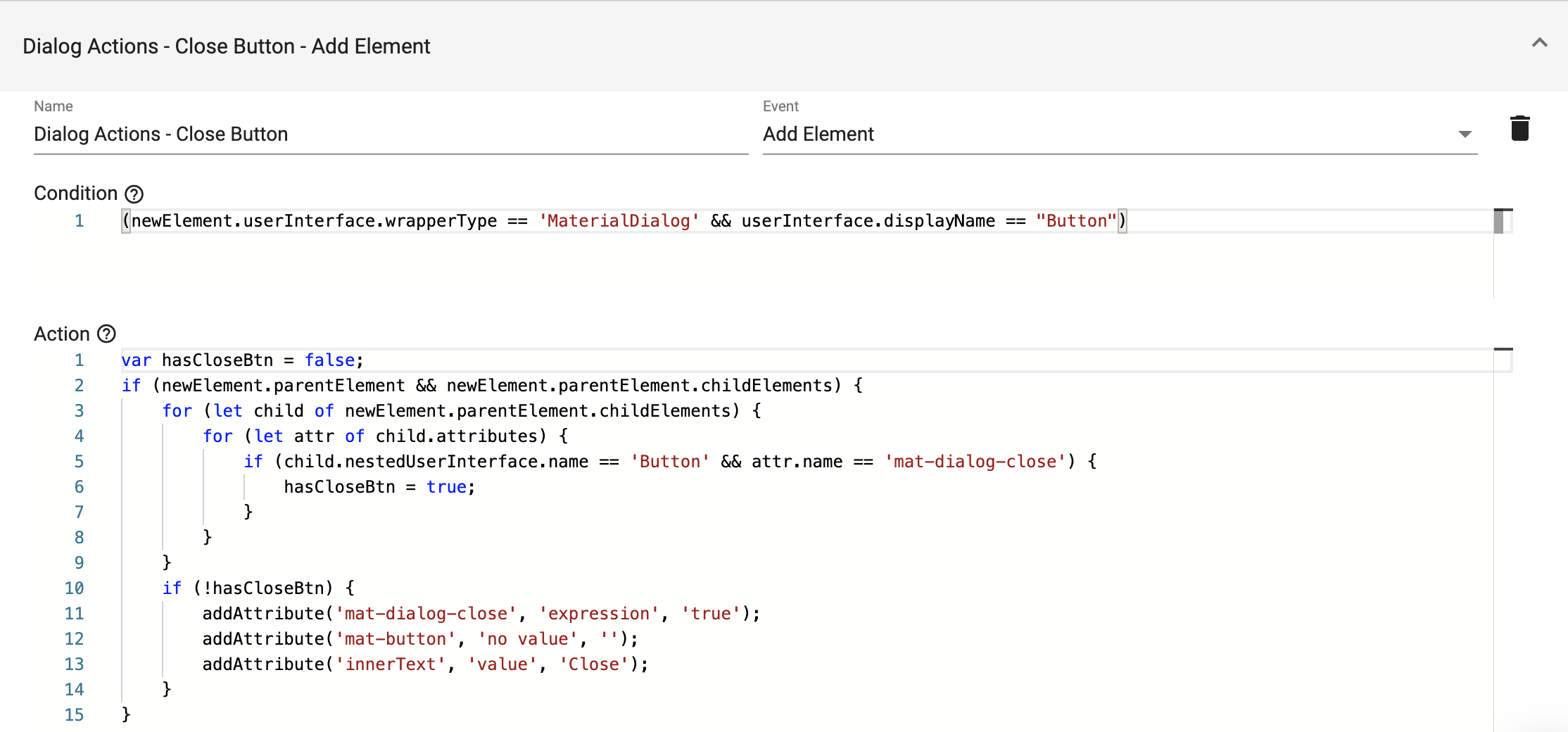
An Action can directly call the methods from the above table or it can be defined with some extra logic. In the following example, we first check if a close button exists in the newly created dialog. If not found, we add it to the dialog.